
Project 1 — Shape Integration
This project was our first assignment with Adobe Photoshop. I’ve played around with the software here and there but never had I completed an actual study with it. I learned a few tricks while working on this project, including creating texture via layers, the different tools for selections like Magic Wand, Lasso tool, and Magnetic Lasso tool.
The prompt itself was rather a challenge. It was definitely a new concept and took a lot of time and thought to put together. We were instructed to create designs out of the negative spaces from a single letter. The restrictions of this project included no additional shapes and modifications of the specific shapes we were left with. It was a project consisting of 10 pieces, 3 equivocal pieces of one letter, 3 unequivocal of the same letter and font, then 4 additional pieces of another letter. I chose the letter Q and P, mainly because the font I chose for the letter Q had a lot of negative spaces to work with and the letter P was easier to use for the unequivocal parts. I struggled with the unequivocal pieces because the font I used for Q was mildly complex and not very recognizable
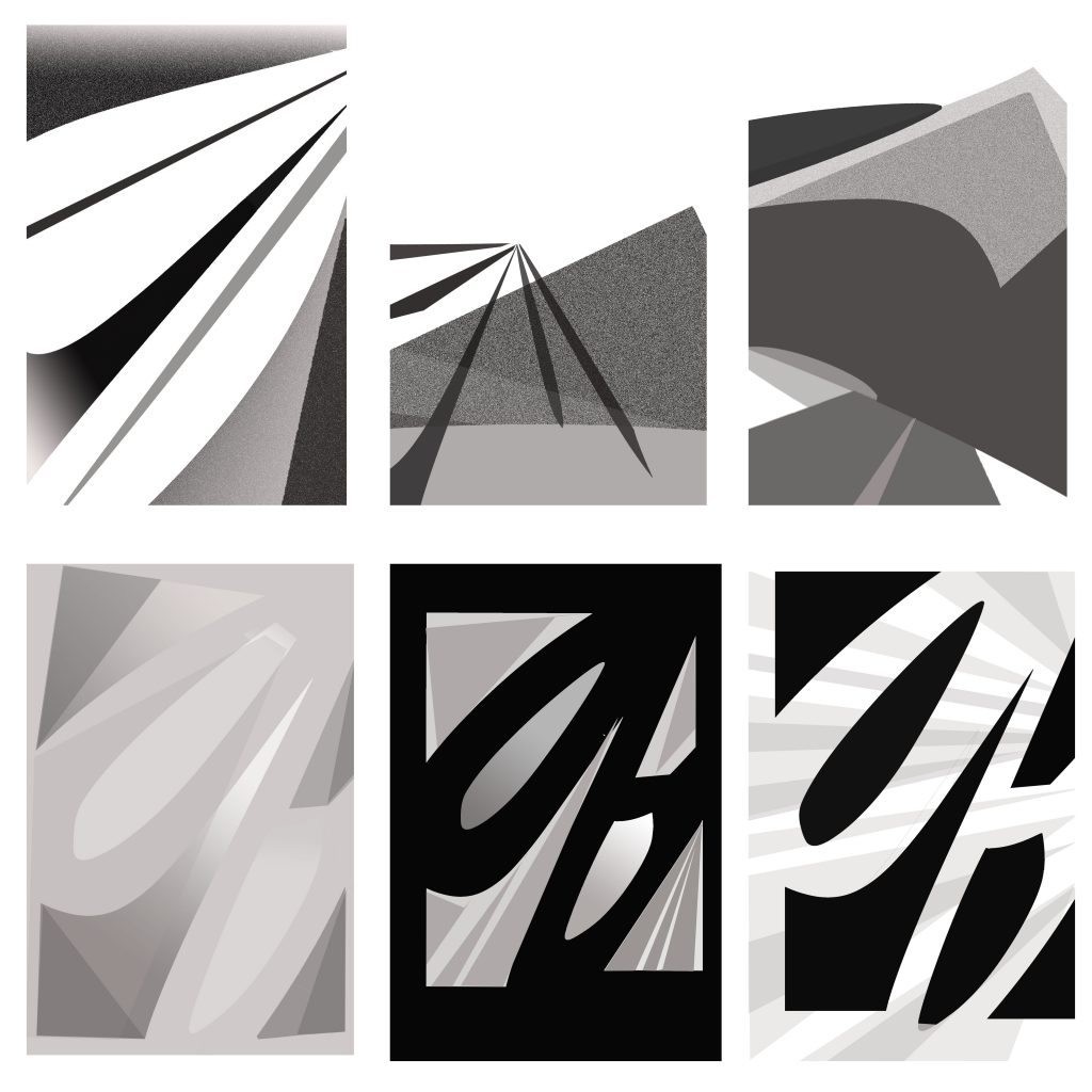
Equivocal and unequivocal pieces for the letter “Q.”
Highlights of this Project
Out of all the ten images I created, here are a few I really enjoyed creating after the process of brainstorming and troubleshooting any turning points:
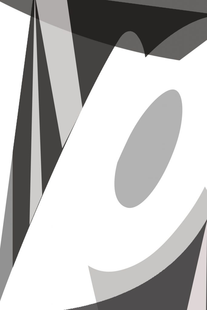
The original letter “Q” used for these pieces.
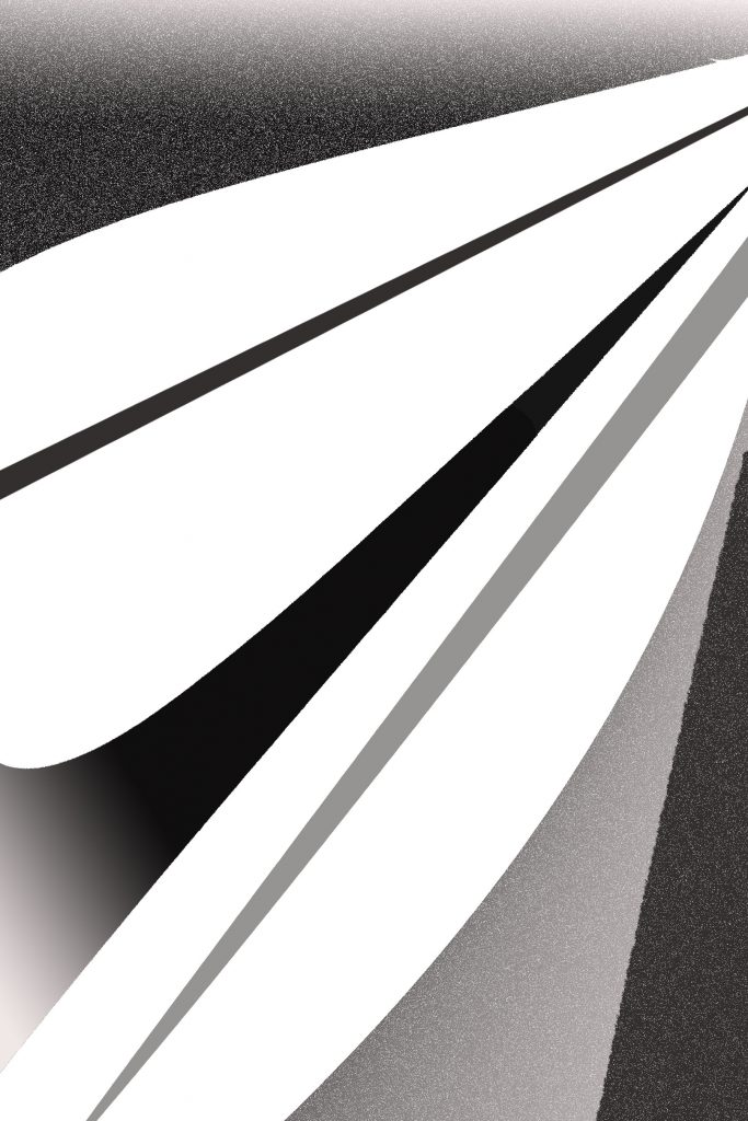
As soon as I saw the shapes I had for this letter, I thought about the various ways I could incorporate them into a landscape. After warping four of the shapes into something no longer recognizable, I managed to craft something similar to a palm tree, as seen in the second photo. Then, I tackled the remaining triangles. The second photo was my initial concept, but it was very tedious. I knew I could’ve done more with it, so after tilting and stretching them enough, I realized I could make a pyramid out of one of the triangles and then stretch the third silhouette so wide that it could act as the sand floor.
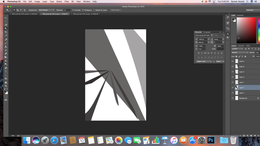
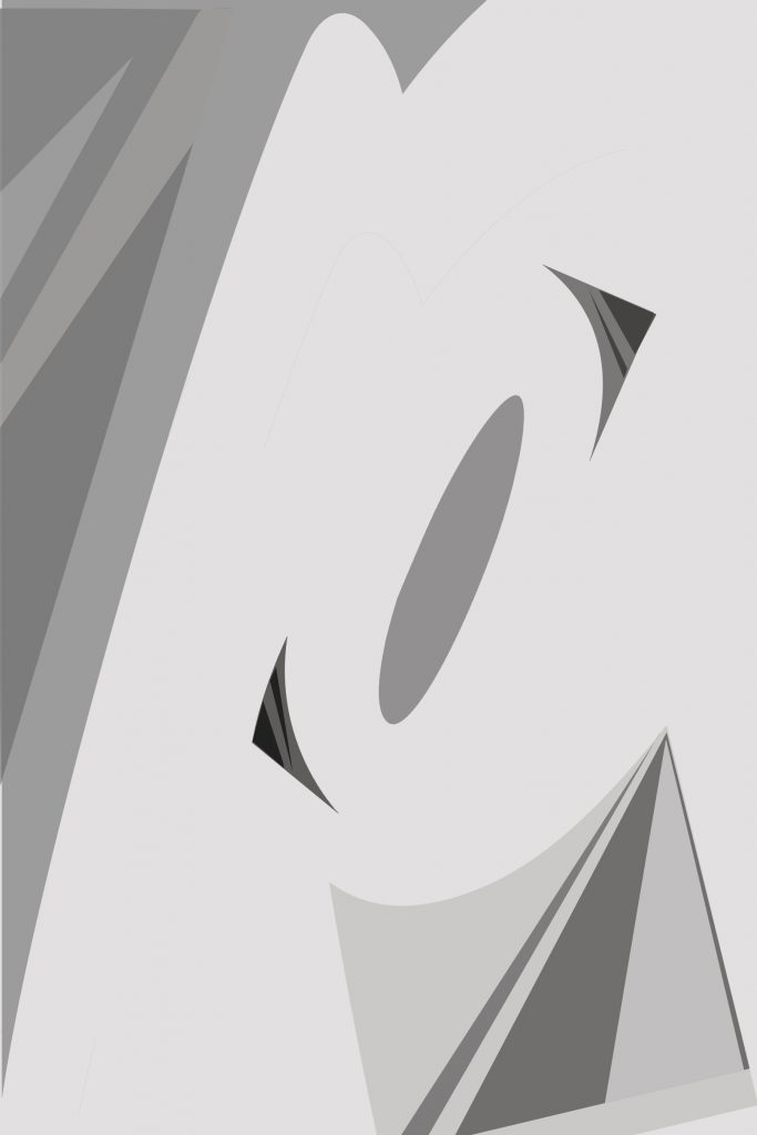
Process for my second equivocal piece using the letter “Q.”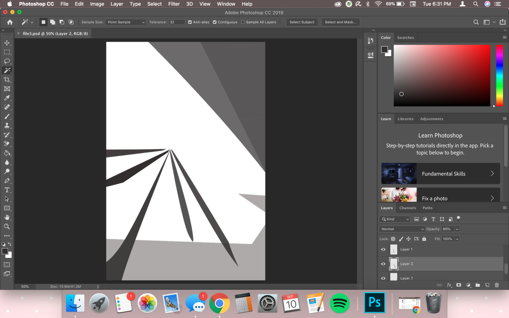
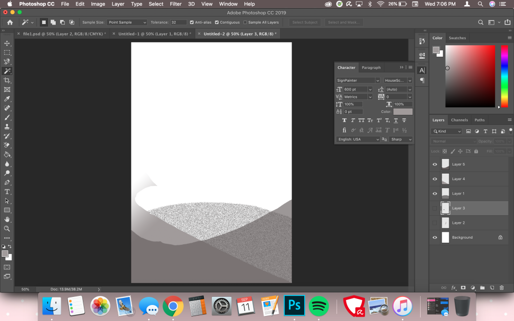
Notice how I still did not modify the triangles into a pyramid. I thought of using them as a ray of sunlight first but was not satisfied with that idea. Compare this screenshot to my final piece:

I flipped the bottom shape around so the sharp edges were no longer visible and lowered the opacity. The two triangles are overlapping each other to act as a shadow. Then I “dissolved” the pyramid’s layer to create a gritty texture, which is perfect to represent the pyramid.
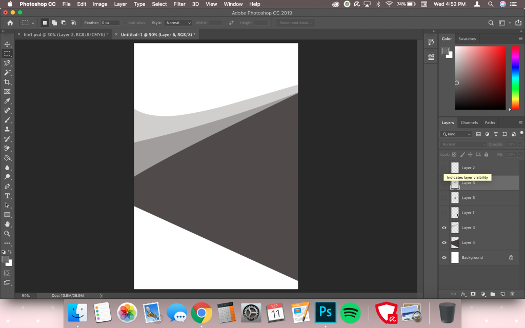
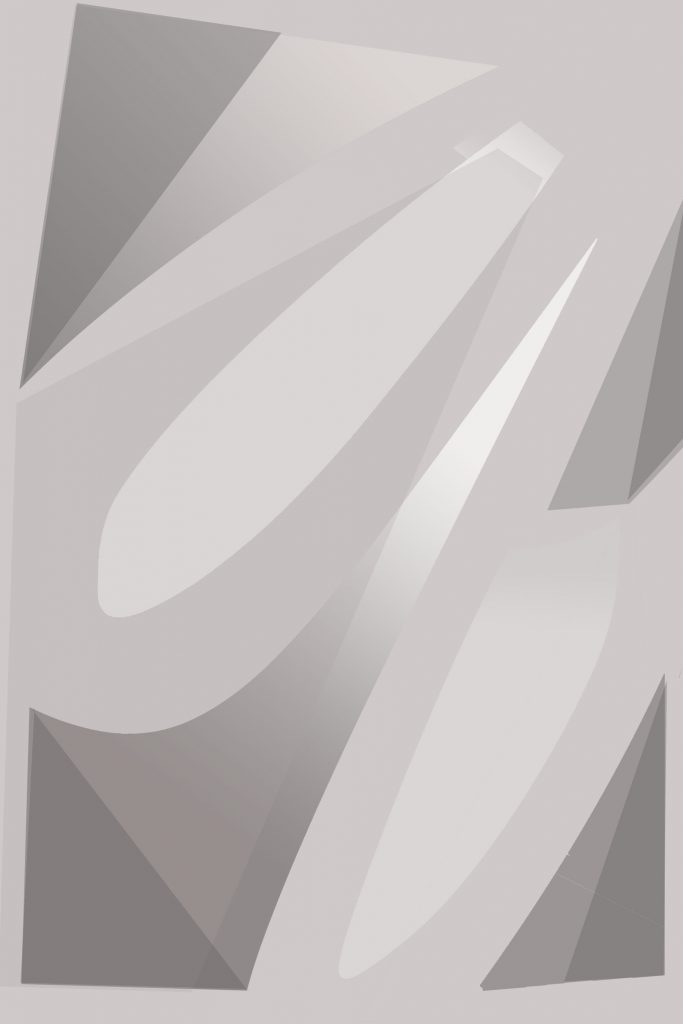
Process of my third equivocal piece using the letter “Q.”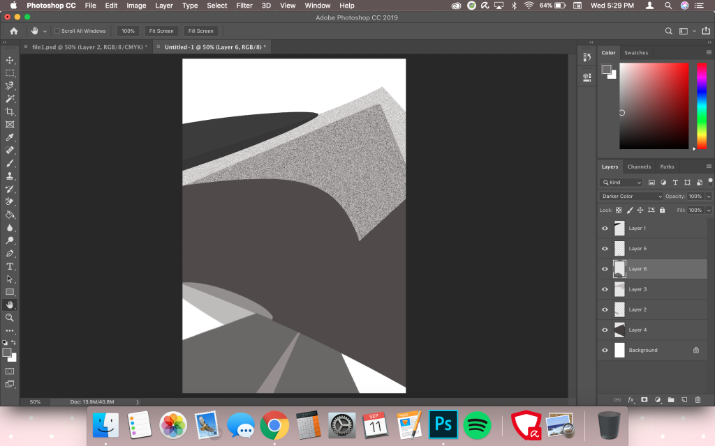
I didn’t have a lot of screenshots for this piece because I was so focused in the moment. I wanted to create another landscape out of the negative spaces but didn’t want to repeat the pyramid and palm tree. So I wondered how else I could incorporate the shapes and realized I could use the triangles as another body, this time as a mountain with snow. I actually took one of the triangles, stretched and rotated it again, then used the shape that I previously used to make the stem of the palm tree as snow. It didn’t exactly match the shape and direction of the mountain so it looks like a heap of snow since I also lowered the opacity and dissolved the layer for that gritty texture again. The dark oval on top acts another mountain or hilltop, while the translucent one below is supposed to be another heap of snow. I stretched one of the polygonal shapes into a road and then warped a triangle so thin it now looks like a lane.

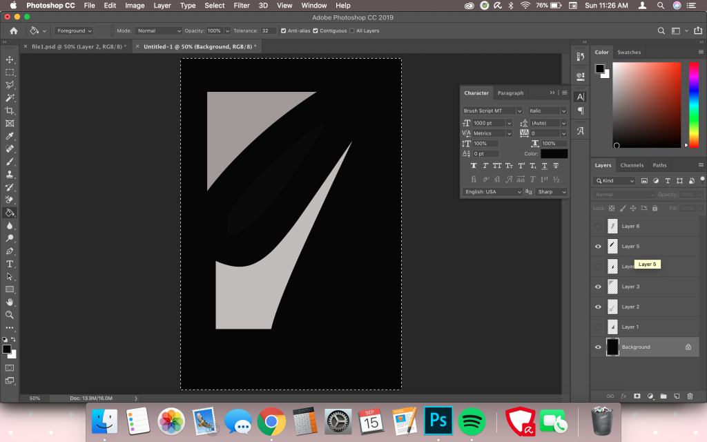
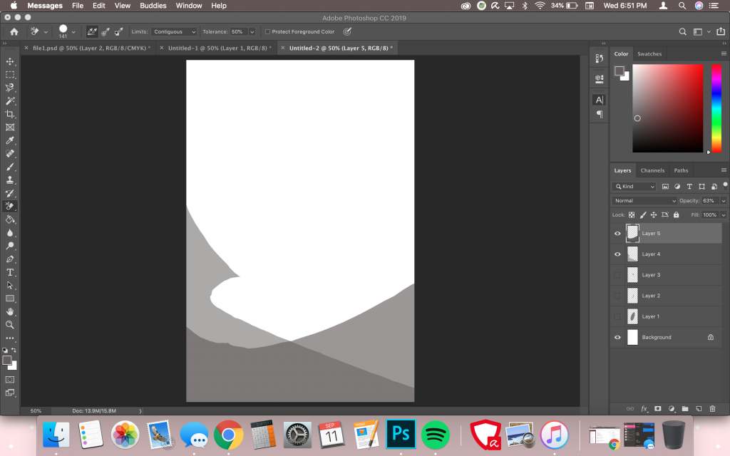
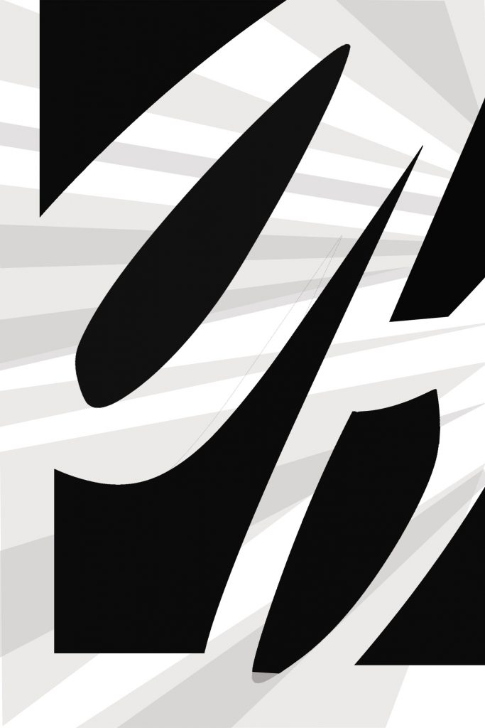
Process of my second unequivocal piece using the letter “Q.”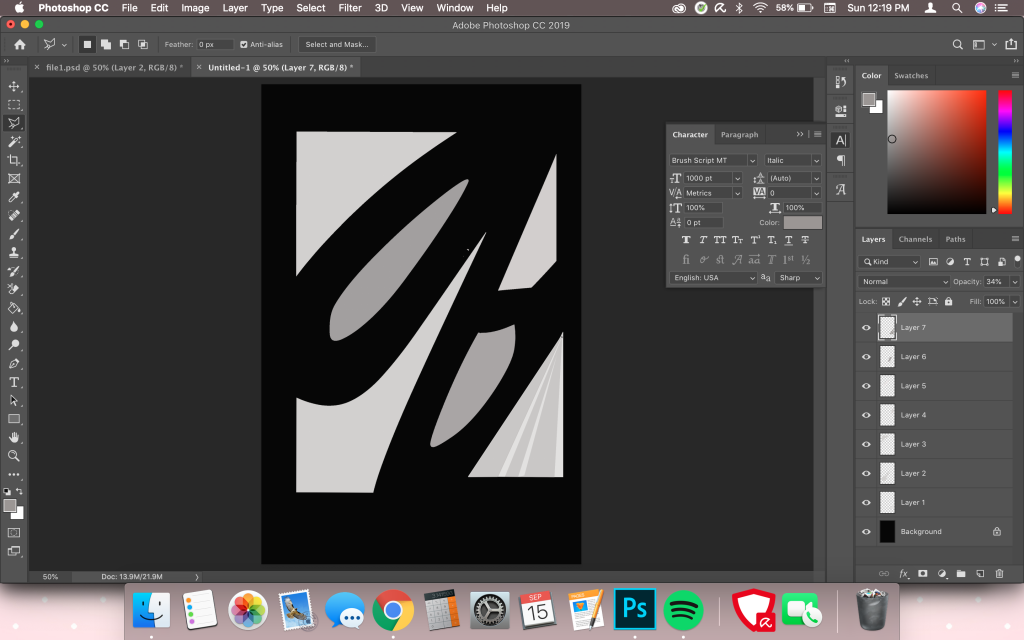
I was told that the unequivocal pieces for my letter would be hard because of how complex the font originally was along with the number of negative shapes I managed to make out. I decided to go simple in terms of this letter since it was already complicated. In this piece, I wanted to use the concept of a broken window creating the Q. I misaligned the shapes on purpose to mimic the position of shattered glass, then added various tones to the triangles. I made sure not to stray across from the shapes since that would technically mean creating an additional shape. The purpose of the black background was to emphasize the shapes as it was and perhaps accentuate the image itself as a whole.

I also used the gradient tool for two of the shapes to create a faded effect. I thought it would suit the design. The use of two tones sort of emphasized the idea of broken glass, although it would’ve looked better outside of the box. Since that wasn’t allowed, I tried to keep within the limits while simultaneously portraying my concept the best I could. The shapes are smaller than their original size because I also wanted to create a frame around it so the letter could be more recognizable.

I really enjoyed using this letter. I feel like it was easier because of the simple design and font. Creating equivocal pieces, however, was a little bit of a challenge since that meant crafting the shapes in a clever manner once again.
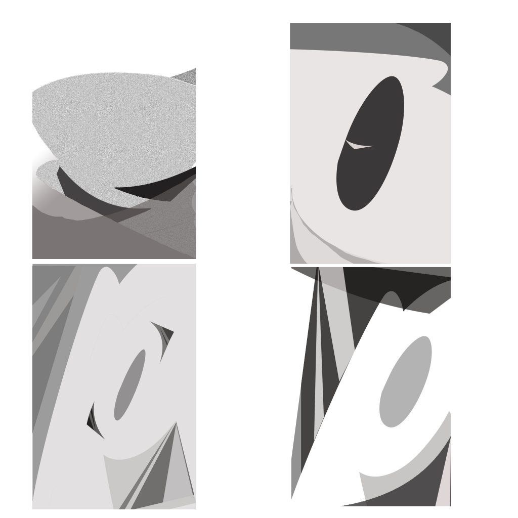
I decided to use the shapes as waves with the circle inside the P as the sun. I overlapped the triangle shapes after stretching them enough to fit most of the canvas and lowering their opacity. I also created a gradient on the second wave to give it that fading effect so that it could look like a wave moving in motion. I also rose the sun a little bit and dissolved the layer for a shimmery effect. The reason why I dissolve the layers often is because that’s currently the only way I know how to add texture and I think they suit the images I tried to convey.

My favorite part of the image was using the two leftover triangles as boats floating down the waves. They don’t even look like boats which is the best part. Viewers can use their imagination in order to see them as boats, even if it’s the first thing they notice. I really like how they float down the waves. It was the only position I could put them in as boats, anyway, but I think the direction suited them.

I really like this piece as well. It’s hard to figure out at first—in fact, I’m not even sure if viewers will be able to see it through my perspective. My concept for this image is a dragon’s eye. The small triangle in the middle of the pupil is meant to be a ferocious glint. I also created two tones out of the bottom and top triangles to create “wrinkles.” I couldn’t add a lot of tones without it looking like additional shapes, though, so I stopped at only two each. The top part is supposed to act as an eyelid and although that is typically not the shape of an eyelid, I went for an animated, cartoony approach. If one were to zoom out the image, they would probably be able to see the eyelid more. It’s meant to be a closeup. I really wanted to add scales but I wasn’t exactly sure how to do that without creating additional shapes. I wasn’t able to dissolve the layers for this piece for some reason, so I went for a flatter look.
All in all, the project was very challenging and I learned a lot of neat tricks and shortcuts for Photoshop. Did I enjoy this project? In the long run, yes, but since we had limitations and barriers I held myself back from breaking any rules. I know I could modify these pictures with additional twists outside of our project’s box. I feel like this is probably not my best work and that I’ll improve within the next projects. I didn’t have a full understanding of the prompts until halfway through the project either, but after looking at different examples I was able to have a general idea of what was required. Still, if I had chosen a simpler letter, preferably in sans-serif, I could’ve done more variety. I like my letters, though. I don’t think a lot of people used a cursive font for their pieces, so I’m glad I was able to try something unusual.