
Project 2 — GESTALT principles
Our second project was an introduction to the 6 common Gestalt principles of design. These principles play a part in how the human eye perceives visual art. We learned how to digitalize and polish our scanned drawings in this project, which was a really neat trick to know. I liked this project because it definitely gave me the opportunity to practice and explore my artistic ability and see how far I could venture. I drew a lot of pieces I don’t think I would’ve tried outside of this project, so I’m glad I was given a chance to try something new and see my hand at contemporary, simplistic designs.
We had a little more than a month to complete this project. During that month, we were instructed to create a total of 30 sketches, with 5 sketches per principle. The sketches had to portray our own definition of the Gestalt principle. We would then digitalize and finalize 1 sketch from each batch, presenting a total of 6 digital pieces. We also had to write the definition of each principle in our own words as a caption for each respective artwork.
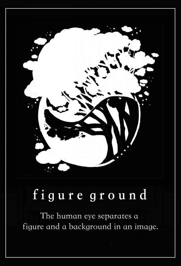
- Figure Ground: The human eye separates a figure and a background in an image.
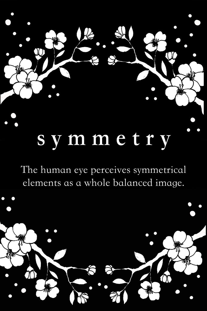
- Symmetry: The human eye perceives symmetrical elements as a whole balanced image.
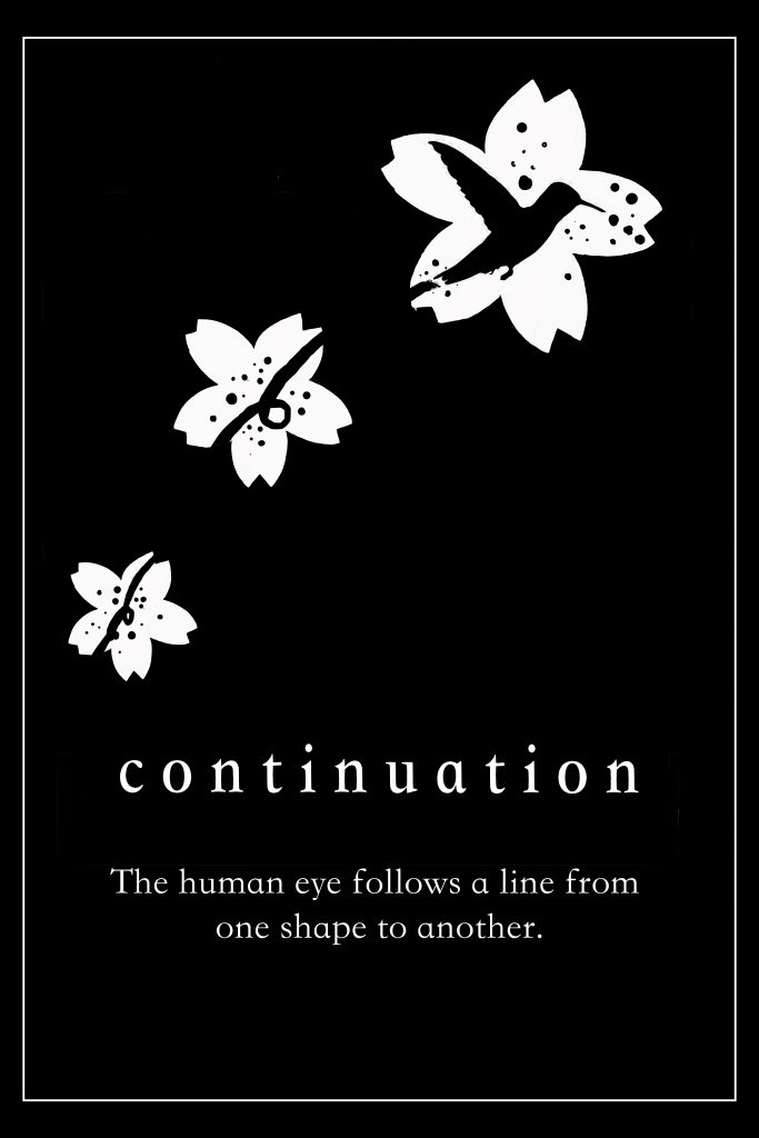
- Continuation: The human eye follows a line from one shape to another.
- Closure: The human eye fills in the gaps to complete an image.
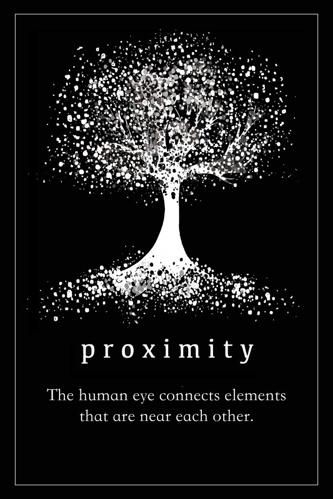
- Proximity: The human eye connects elements that are near each other.
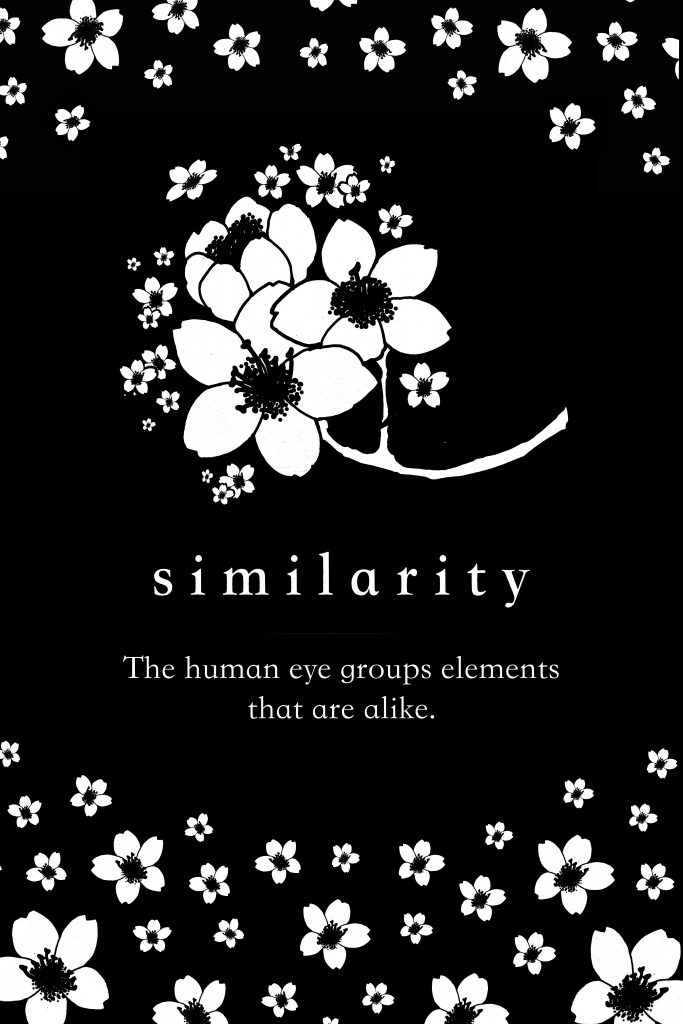
- Similarity: The human eye groups elements that are alike.
We were required to choose a theme that we’d be consistent with—meaning, we couldn’t create sketches of random concepts that didn’t correlate with each other. Every piece had to be unified in some way. My theme was cherry blossoms. Not only is it my favorite flower, but the flower and tree itself is so diverse and can be drawn and depicted in many ways. I knew this would be my theme as I started venturing towards the topic of nature. I first started with plants in general, and as I drew closer towards choosing a specific flower, I figured there would be a way to incorporate cherry blossoms in every Gestalt principle.
Figure Ground
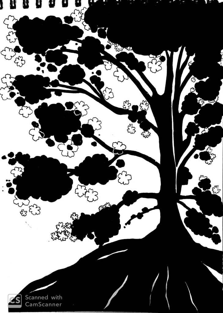
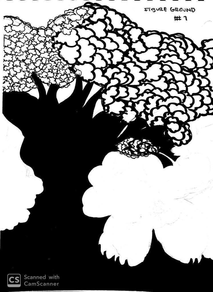
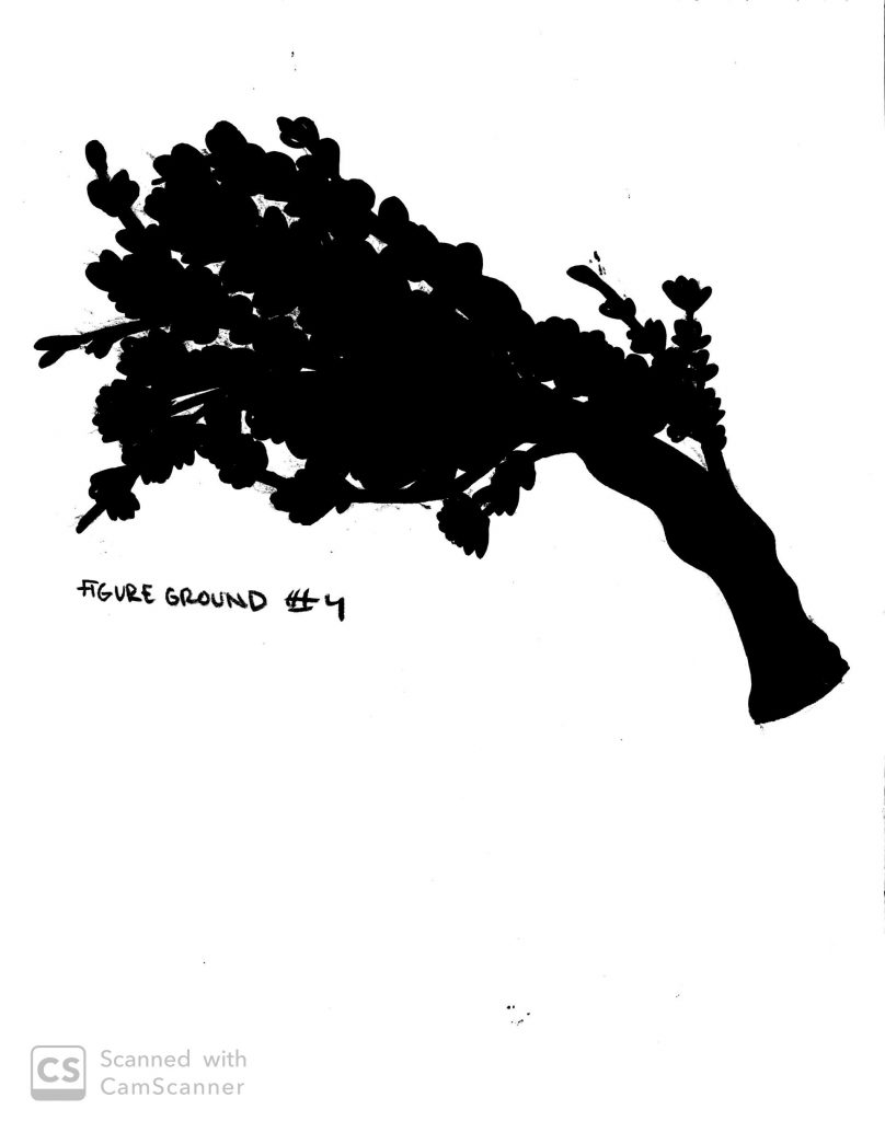
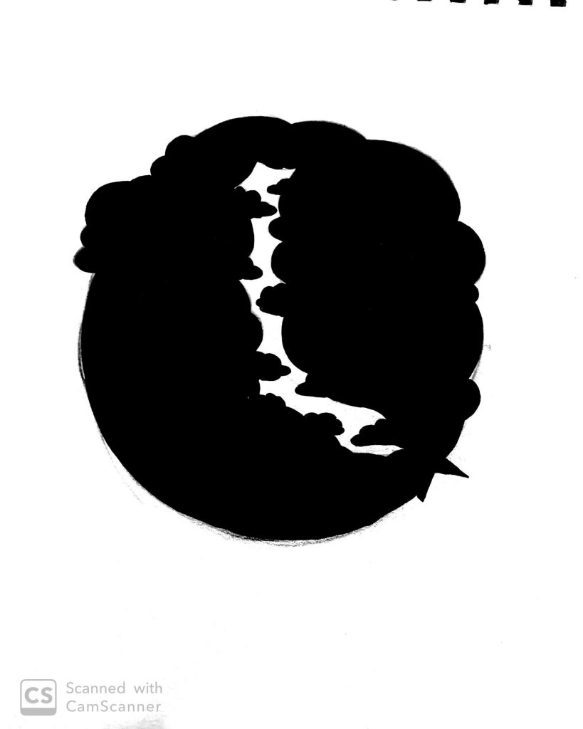
These were the 5 sketches I had for the figure ground principle. I wanted to incorporate a second figure into the piece, but it was hard to insert something legible. After trying a few figure ground reversal sketches, I decided to stick to just figure ground without adding a second figure.
Symmetry
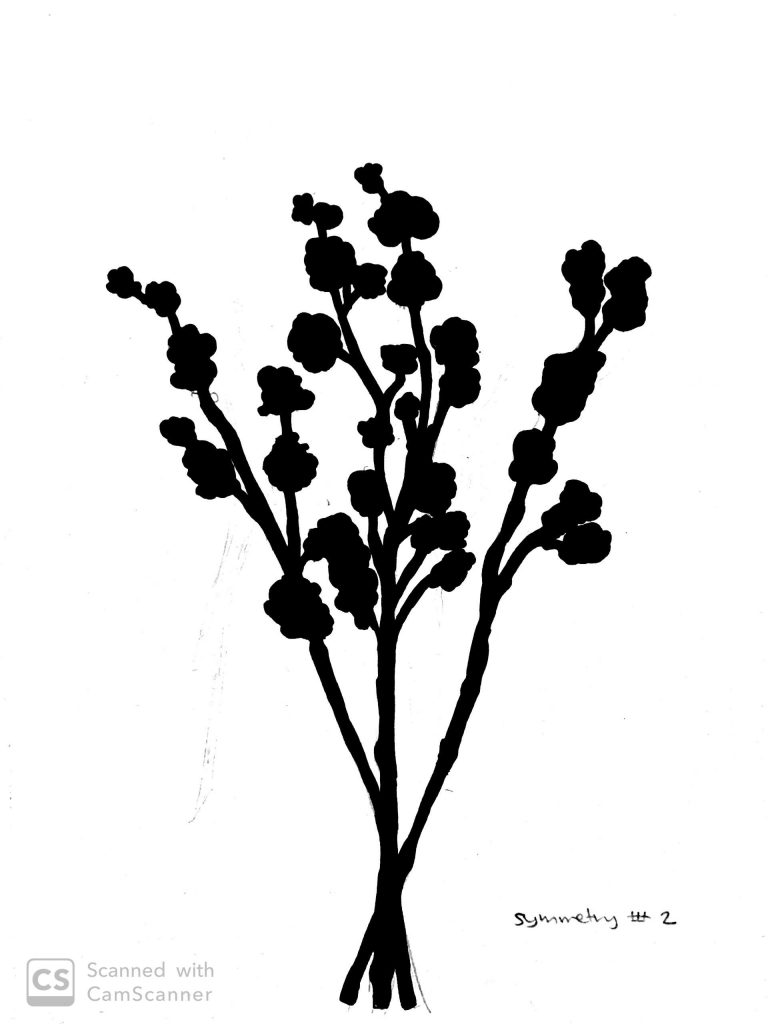
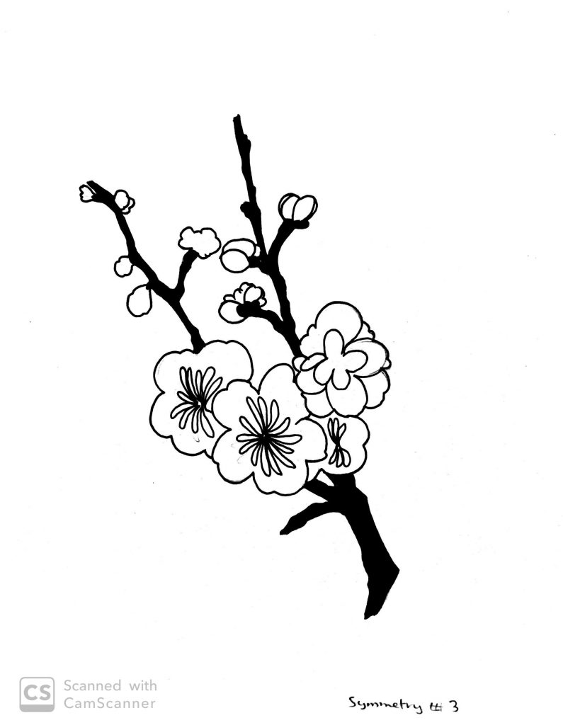
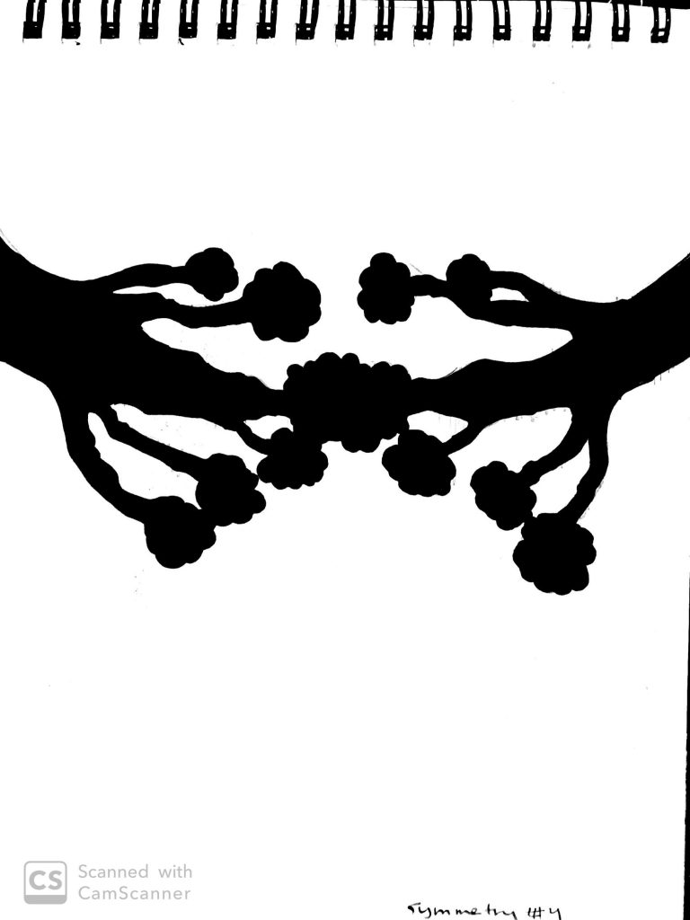
The sketches I drew for symmetry were a little different. Because we were supposed to choose one final sketch to digitalize, I only drew half of each sketch so that I could mirror the sketch in order to make it symmetrical. It’s easier with flowers or tree branches since nature is usually symmetrical anyway.

Continuation
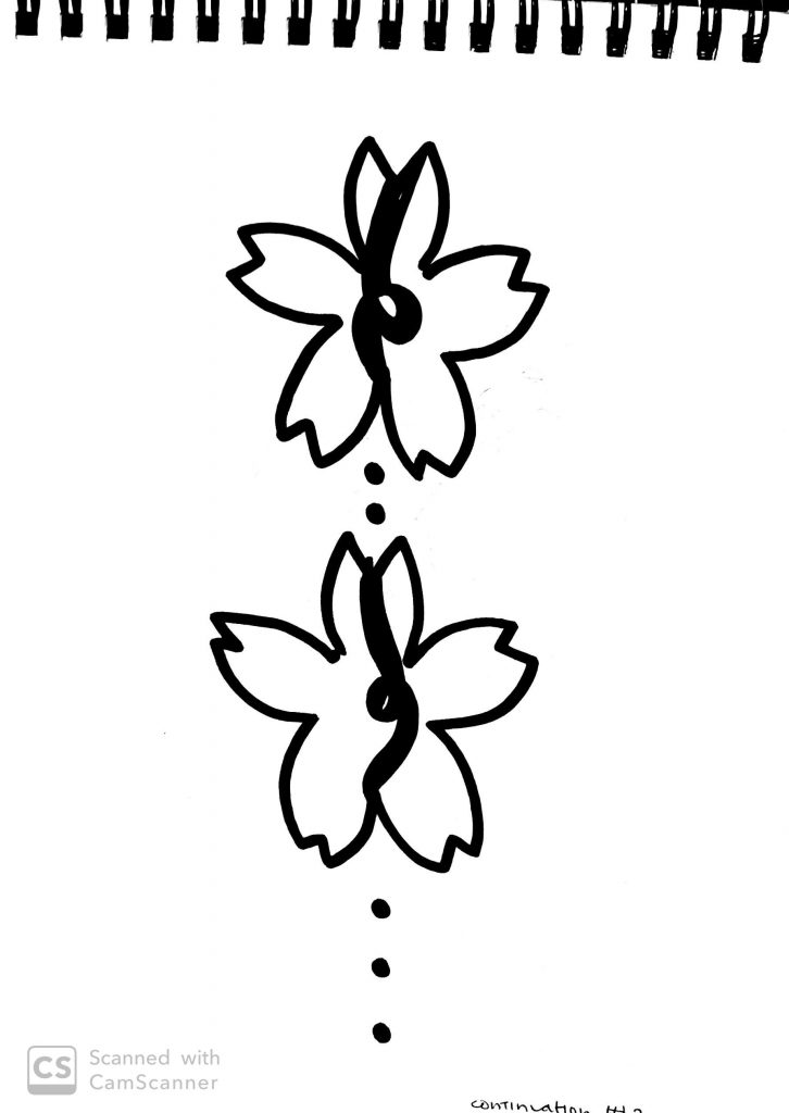
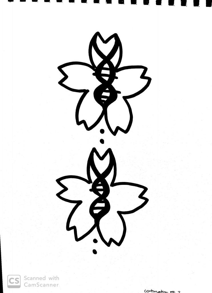
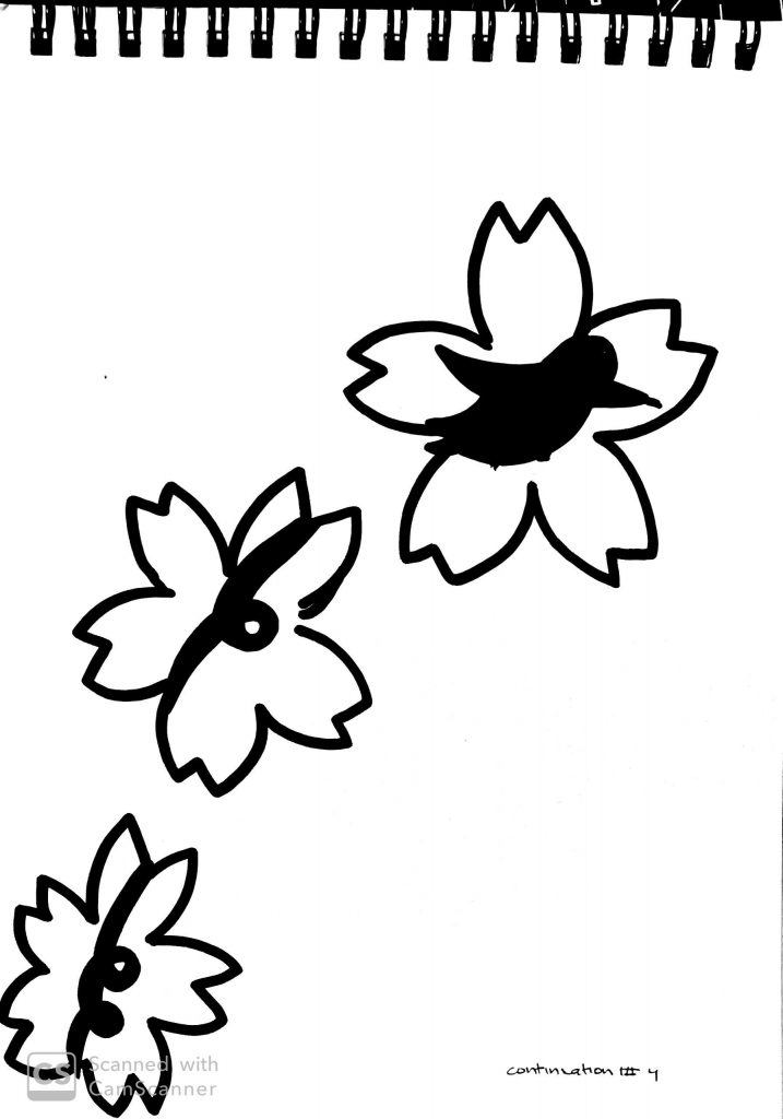
This principle was a little confusing at first. I didn’t completely understand the design until one piece I finalized received feedback. I was able to create more accurate pieces thanks to the constructive criticism. Most of my pieces incorporated solid direction of lines such as ribbons, a hummingbird’s path, and DNA.
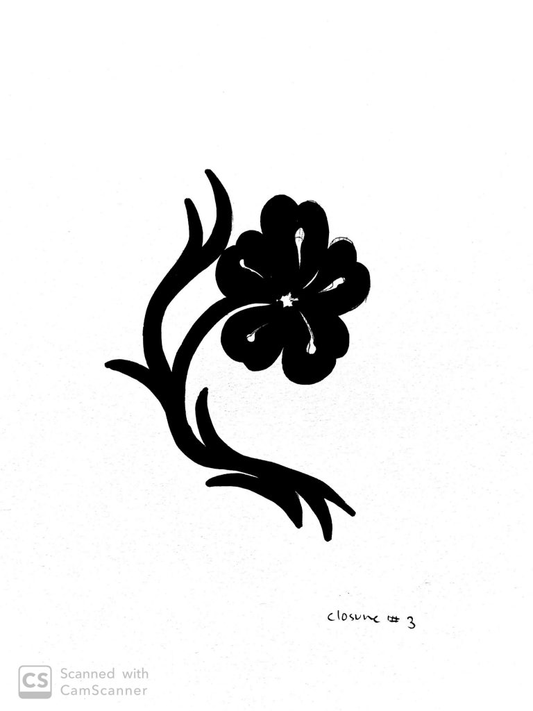
Closure
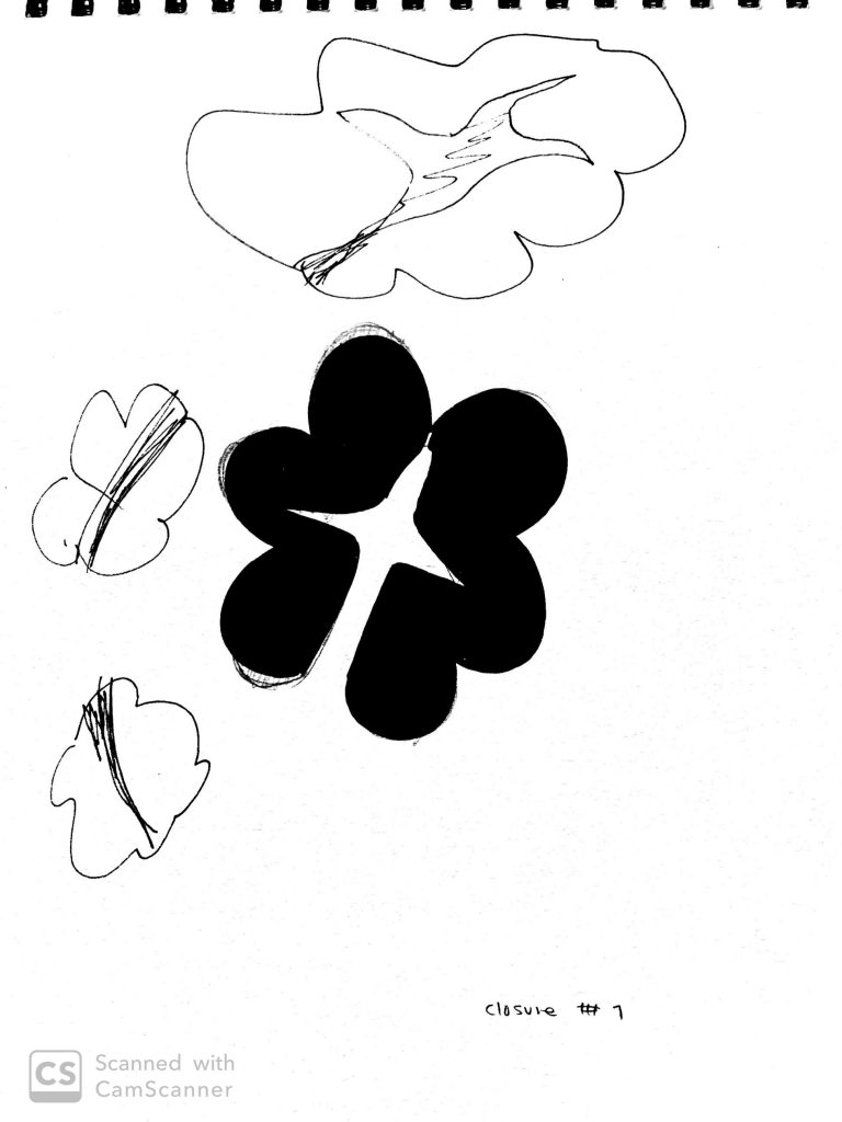
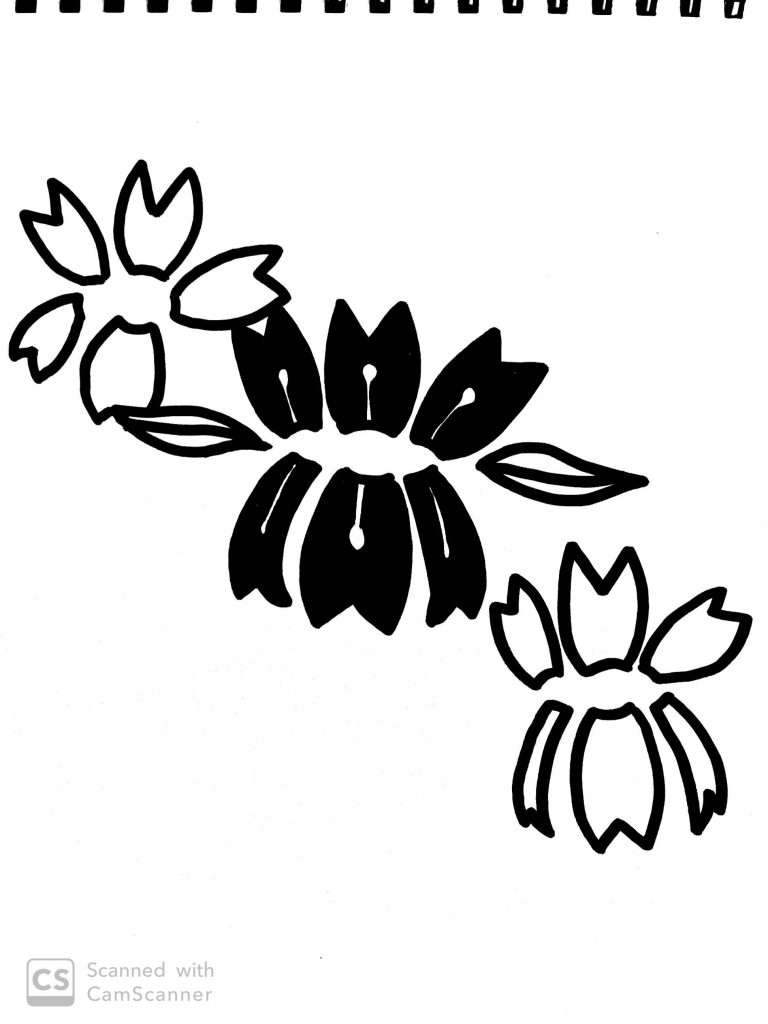
I ultimately knew what I wanted to draw when it came to the closure principle, however, I didn’t think of it thoroughly when drawing. I initially thought that the amount of space between each object didn’t matter as long as they were apart. After receiving constructive criticism, I realized that the larger the gap between objects or elements, the greater the closure was, which made a better rendition.
The first piece below was my original piece for the closure principle. after receiving some feedback, however, I realized that it did not exactly fit the criteria for closure since viewers were able to tell that the ambiguous figure was still a flower at first sight. I had to recreate the flower in a way that would make viewers question whether it was a flower or not. As a result, I cut up the petals of the first five flowers in a way that it looks disintegrated. They still maintain the backbone of a flower but at the same time, it doesn’t look like a flower immediately. I only did it to the first five because they were the largest and most prominent. I left the smaller ones alone so that it could viewers a hint in case they can’t figure it out.
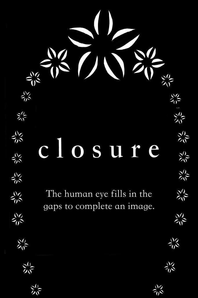
The initial finalized piece for the closure principle. 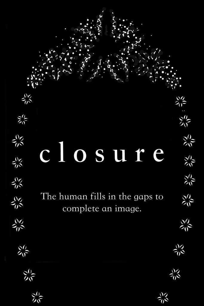
The updated finalized piece for the closure principle.
Proximity
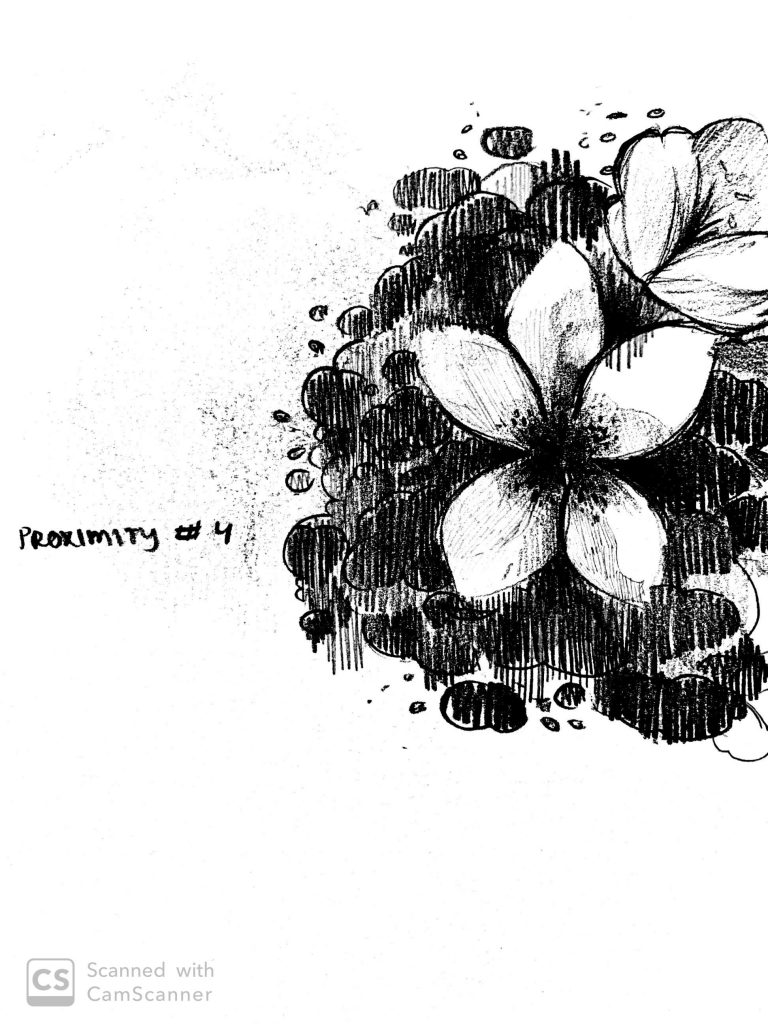
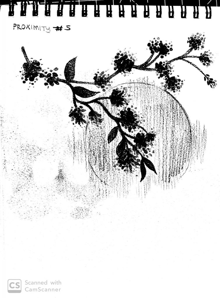
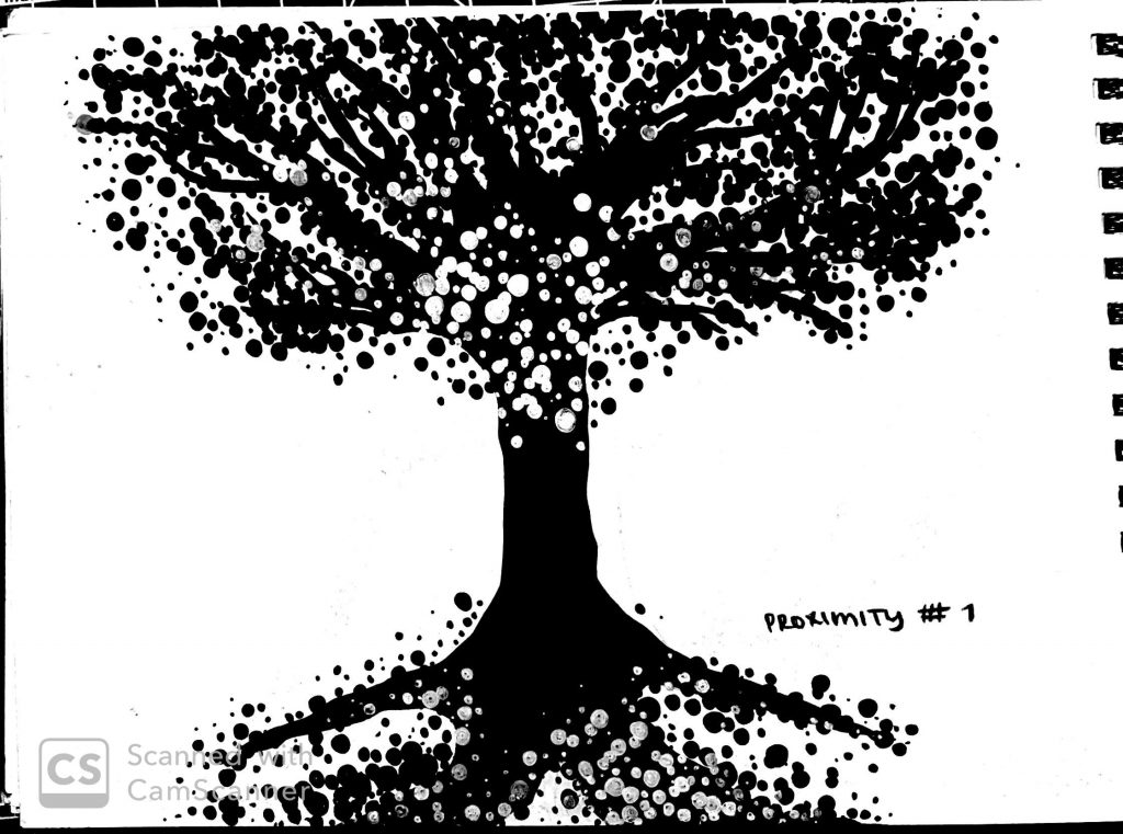
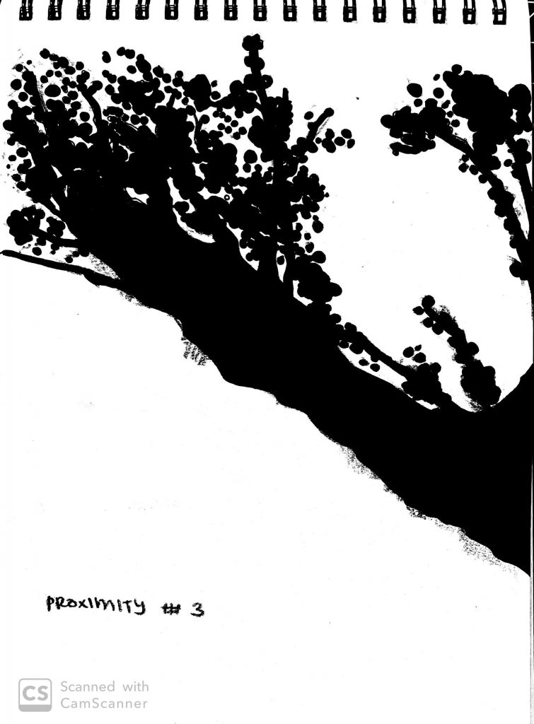
Drawing for the proximity principle was a little tricky because I wasn’t sure how to incorporate the proximity between shapes while maintaining the figure of cherry blossoms. I decided that I’d have to use a cherry blossom tree for this principle rather than individual flowers. While that did make things easier, I spent a lot of time hand drawing the finalized piece because it required over 100 dots in the form of leaves.
Similarity
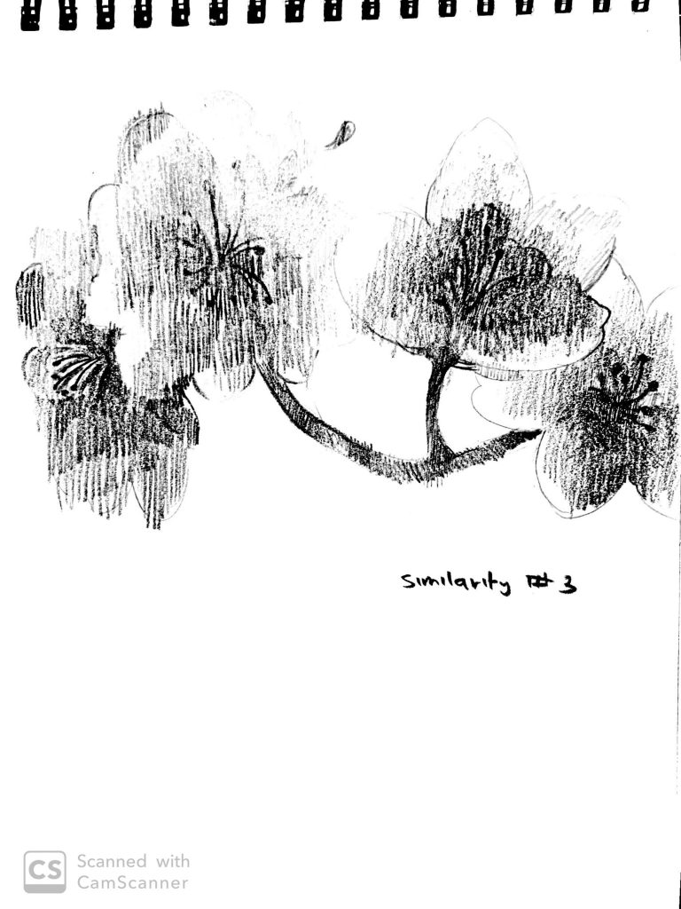
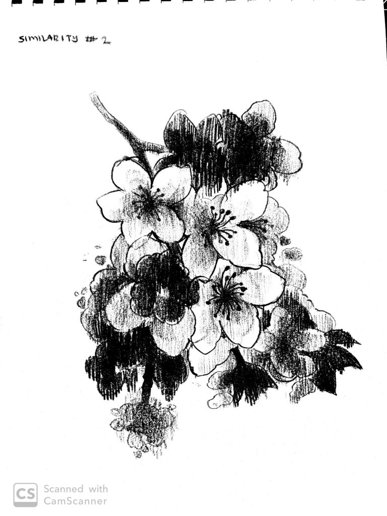
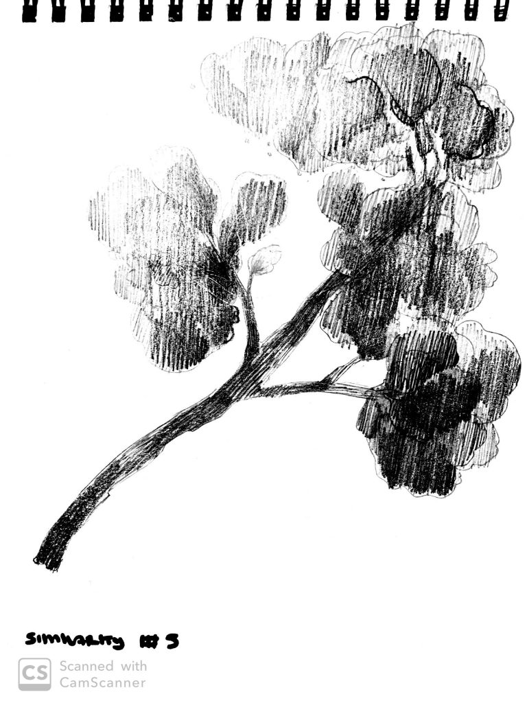
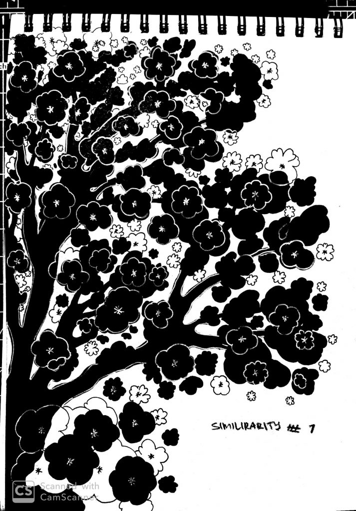
This was my favorite principle to draw. I got to use clusters of cherry blossom flowers to define similarity. I liked trying out different studies of individual cherry blossom branches but ultimately used the fourth sketch to create an array of assorted flowers.
Overall, this project, as long as it was, taught me a lot. Finalizing the sketches took longer than the actual brainstorming process. There was a lot of polishing, typing, adjusting, and redoing involved. I’m pretty happy with my results and printed them out. They came out very nicely, almost like a book cover. That was an exciting stage of the project.