Philately: The Nishikigoi Series
After a monthlong process, we finally completed our first project for Advanced Digital Processes. The project, named philately, is based off the word’s definition, a collection of postage stamps. While the project itself wasn’t necessarily about collecting stamps, there was no better way to name the project.
We were asked to design a series of stamps that reflected our artistic style with a theme or purpose in mind. In retrospect, that sounded simple enough, but the journey to narrow down the prompt said otherwise. In fact, I changed my designs and ideas three times before finally deciding on my theme.
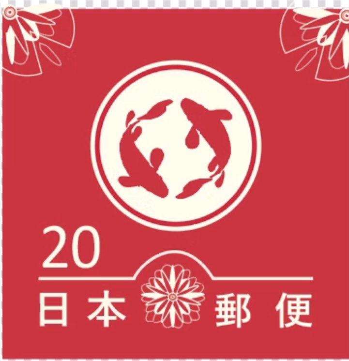
Most of my classmates created stamps based on political movements, personal issues they wanted to convey, or social conflicts that are common in our society. My approach was entirely different and rather simple. As a fan of Japanese culture and a student taking elementary Japanese, I wanted to base my design on traditional Japanese postage stamps. I can’t guarantee whether this specific stamp is widely used in Japan and it’s probably for aesthetic purposes, but I enjoyed the minimalistic characteristic of this design, specifically the use of duo-chrome and graphic illustration.
Judging from the photos I collected, the majority of the themes or illustrations in my references were either iconic Japanese landmarks, like Mt. Fuji or shrine temples, the Japanese flag, etc. It’s safe to say that the red and the white colors most likely represent the Japanese flag and the country’s Japanese name Nippon, which translates to “Land of the Rising Sun.”
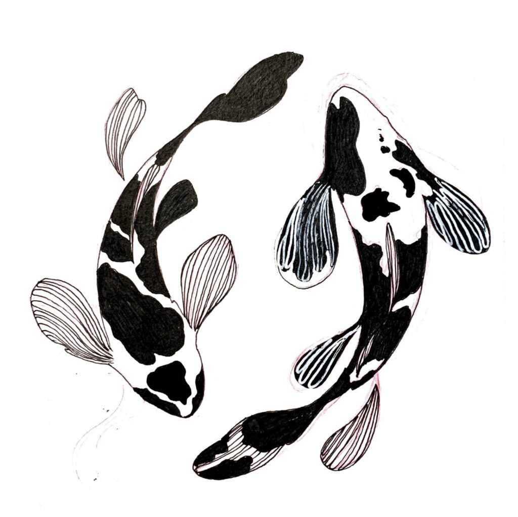
I knew I wanted to use koi, or colored carp, from the start. Not only are they one of the prettiest fish, the illustrations of koi fish range from simple to complex, so it gave me many ideas on how to design my own. I especially loved how koi fish were illustrated in Japanese art and media. They’re so dynamic and delicate. Additionally, the fact that koi fish symbolizes luck, strength, and perseverance in Japanese culture is a plus.
The Process:
While the duration of the project lasted around a month, I think the actual process of my own stamp was a few weeks. Although I was a complete amateur with Adobe Illustrator, I had some experience from a previous class, so it didn’t take long for me to pick it back up. Still, I wasn’t comfortable working on my own and relied heavily on tutorials and videos. Professor Nell also walked us through the basics of creating the stamp frame, adjusting the tiny dimensions, and adding text.
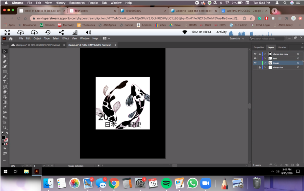
I only used one tool for the span of this whole project—the pen tool. Initially, I wasn’t fond of this tool simply because I couldn’t understand its purpose. I found the paths, anchors, and handles all too confusing to work with. However, after practicing the tool by lining my sketch a few times, lots of trial and error included, I fell in love with the tool and used it for everything I had in mind. The pen tool literally brought my envisions to life and I wouldn’t have been able to digitize my sketch without it. Some of the significant features of the pen tool I used include tracing my sketch, creating geometric shapes by modifying the paths and filling in large areas of space. The koi fish circle was created entirely through the pen tool with little to no modification needed.
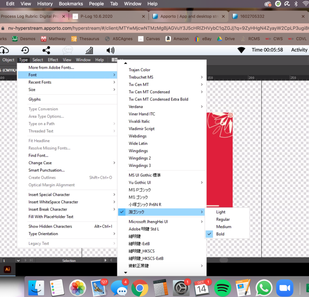
Since I’m not familiar with Japanese kanji, or the Japanese equivalent of Chinese characters, I didn’t know what font would to use for my stamp. I haven’t felt the need to download many fonts in my life before, but the default fonts for Chinese characters in Illustrator were very basic and did not fit my design. I knew I had to download a font specifically for Japanese characters, even though the characters I’d be using were Chinese. This was pretty apparent when most of the Japanese fonts only supported a very limited range of Chinese characters. The Japanese typesetting tended to have thick, bolder font type compared to Chinese. I felt that Chinese style fonts would be too thin, and if I wanted to keep the essence of a traditional Japanese stamp, I naturally had to download a Japanese style font.
I ended up using a common font used for Japanese media and commercial use. Funnily enough, that was the only font I used. It also resembled the font I’ve seen in my reference photos, if not the same.
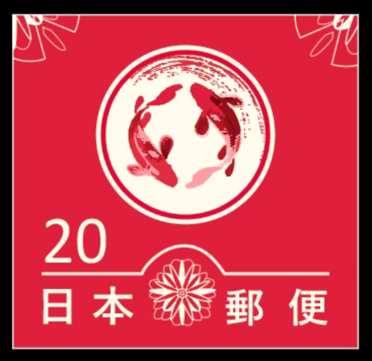
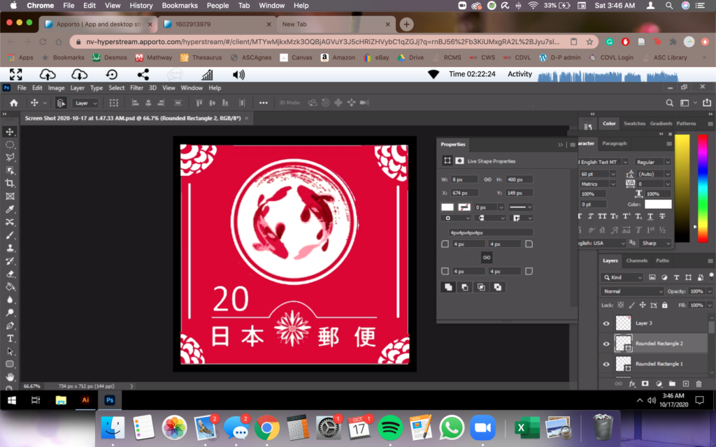
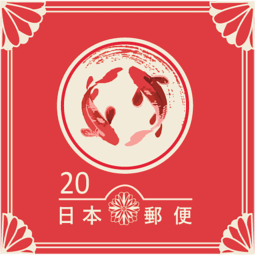
As engaging as the project was, the actual work was very tedious. The scales were my favorite part of the entire design and yet the line art killed me. I spent around 3 days working on it. It doesn’t look like a lot but when zoomed closer, you can see the tiny details that I absolutely had to get right. After the line art though, the color picking was easy and a nice break. I used a red color palette from Google and with the color dropper, picked, and chose the colors I wanted for each scale.
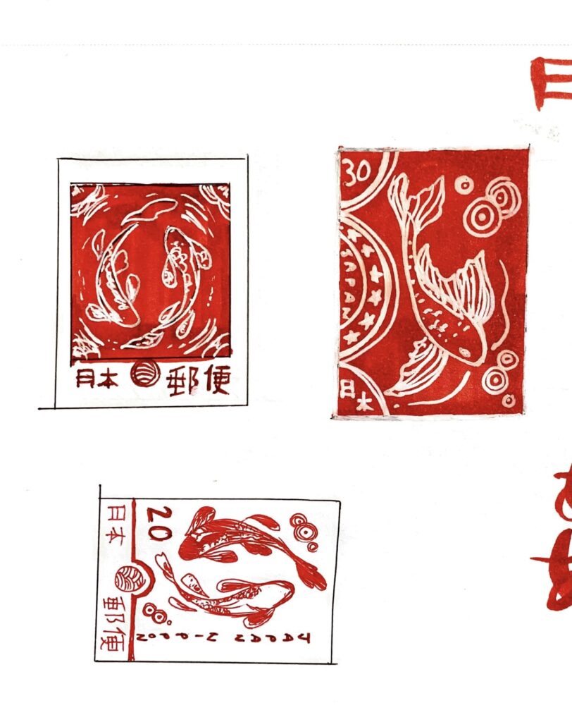
Being this deep into the process called for some feedback. So far, I was happy with what I had but felt that there was something missing. I wasn’t sure whether it was the need for additional text on the side to enclose the circular pond, or if the composition was bottom heavy. After running it through Professor Nell, her main suggestions were:
- A border of flowers on the sides instead of additional text.
- Either making the pond larger or the text and text divider underneath smaller because the balance was too even
- Keeping the ripples in the circle asymmetric and top-heavy instead of having it on both sides
I also agreed with these suggestions and implemented all of them into my final design. Prof Nell recommended to use Photoshop as a way to experiment with different possibilities, that way I can change exactly what I wanted to keep instead of constantly redoing and undoing.
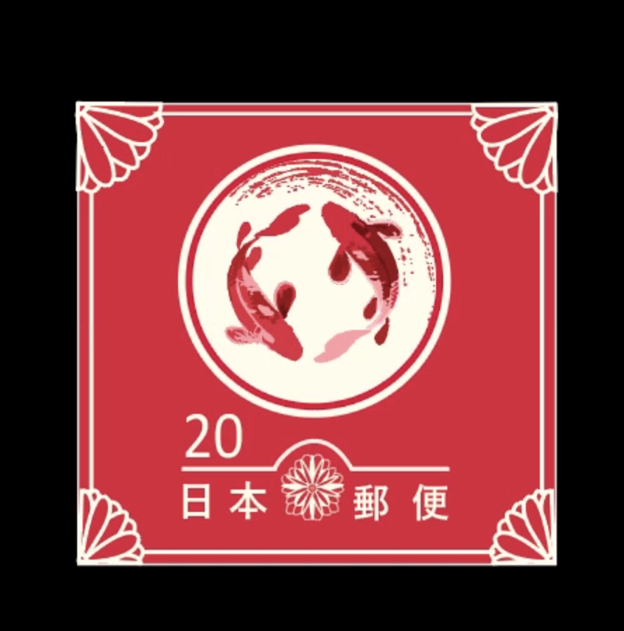
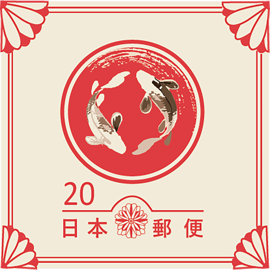
After playing around with Photoshop, I decided on enlarging the circle and keeping the text smaller. Changing either one of them made the composition too awkward, but my friends also agreed that it was best to adjust both. I also did a rough sketch of the border by drawing over the flowers and adding a geometric design inside the half-circles. The sides still felt empty, so I quickly constructed some lines in an attempt to create an optical illusion between the circles.
Because I found the geometric design inside the circles difficult to execute on Illustrator, I went with flowers instead. The flowers are larger than my original design and I preferred the bold lines and simplicity compared to the previous ones. While my border in the photo above contained one line, I added one more later on for closure.
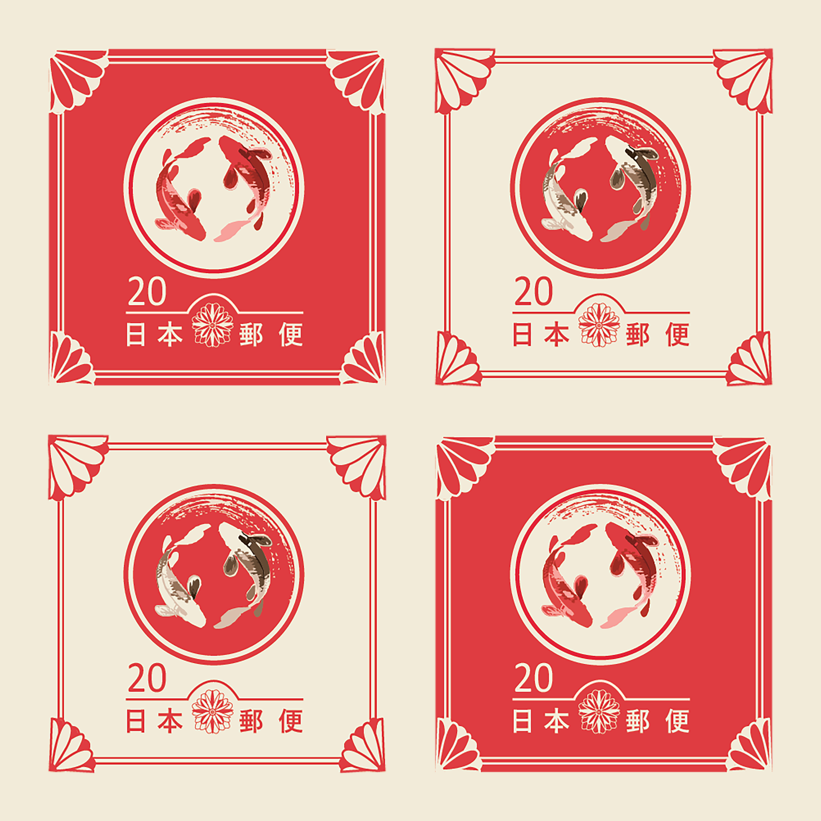
Now that I had my red version of the stamp finalized, I had to create an inversion of my original stamp to complete the series. While most students created a series of 5-6 stamps, both Prof Nell and I thought two stamps retained the essence of my theme, especially since I wanted to focus on my koi illustration.
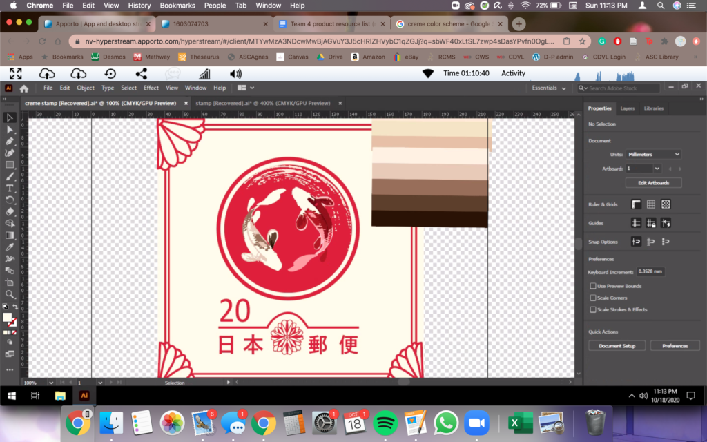
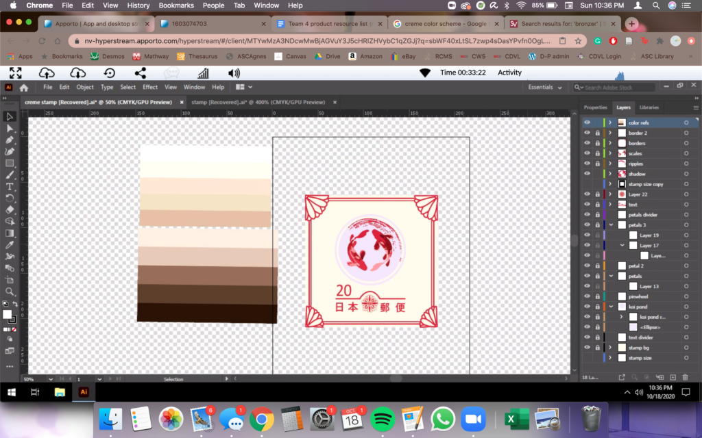
The inversion basically meant a red on creme design, which was fairly easy. I simply created a copy of my red stamp file, that way all the layers would be kept and all I had to do was switch colors using the color dropper. Unlike the red palette I used earlier, it took me some time to find a suitable creme-based color scheme that would relatively work with the red design. In the end, I just mimicked the same shades and tones I used for my scales, but just in a different color scheme.
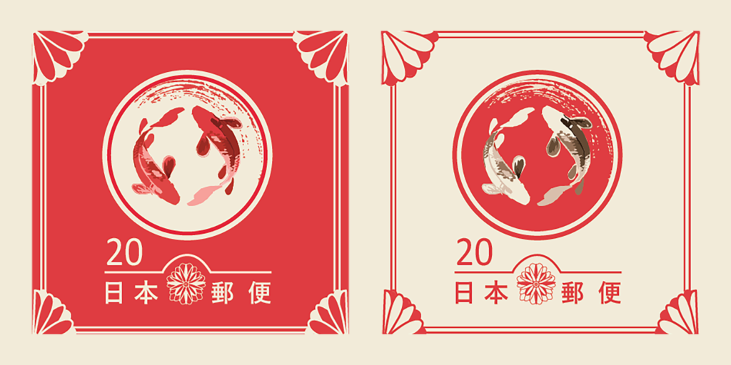
After a long process of sketching, digitizing, discussing, and editing, I completed the two stamps and constructed them into a collage. While this collage showcases the immense detail of both stamps, I don’t think it does the unity of the two stamps justice the way a collage of four stamps does. Prof Nell suggested placing each stamp across from each other so that it unifies the stamps as a whole.

Overall, I loved this project. Despite the long, tedious process and nights spent tracing tiny details, I especially appreciated the freedom Prof Nell gave us. All we had to work with was the prompt and the rest of the choices were ours. Projects like these have a successful and diverse turnout and really illustrate the various styles the students possess. There’s so many ways to go about it and yet each students’ submissions were completely different from the other. This project definitely gave me the opportunity to maintain my artistic style while trying something new. Having a set of beautiful, custom-made stamps catered to my own passion and liking is just a plus.