
ART 244 Process Log 1
For our first assignment this semester, we visited the Romare Bearden Exhibit at the High Museum of Art in Atlanta and observed his art style and artwork. We were required to choose one of his pieces that spoke to us and work with it for two of our assignments. After a while of browsing, I finally settled down on this piece called Uptown Manhattan Skyline: Upcoming Storm.
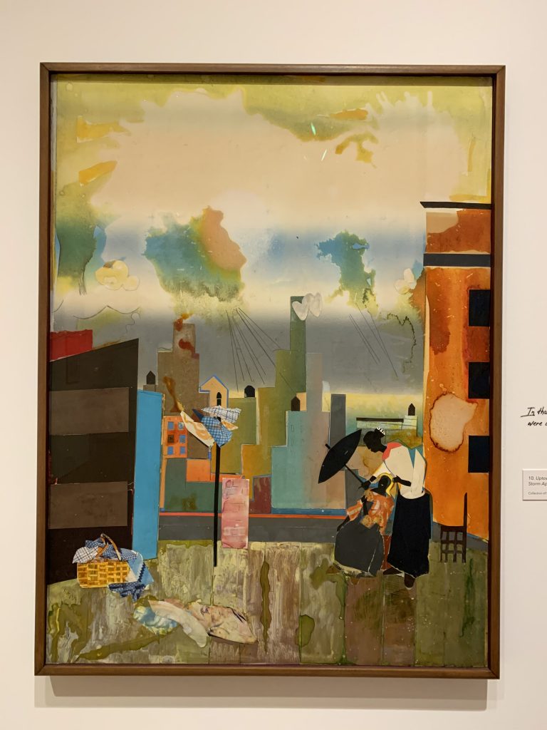
I chose this particular collage because I was intrigued by the way he painted the sky. As an artist who works with watercolor, I could spot the medium from a mile away. I loved the way he combined different colors of the sky and sunset into splashes across the sky. The splotches of yellow and green reminded me of a storm approaching the horizon. I also liked how he used pieces of different materials and mediums to craft the skyline. Because I’m from the city, seeing this collage of Manhattan struck a sense of nostalgia within me. It’s safe to say I ended up choosing this piece because I also felt pretty biased.
Our first week of class was pretty simple. We were asked to interpret the collage we chose by pointing out the organizational, directional, and implied lines of the piece. It’s been a while since I heard the elements and principles of design again, so I was a little confused when we first got to work. Luckily, since the class is a combination of both beginners and intermediate-level students, we went over the terms before officially starting the assignment on our own.
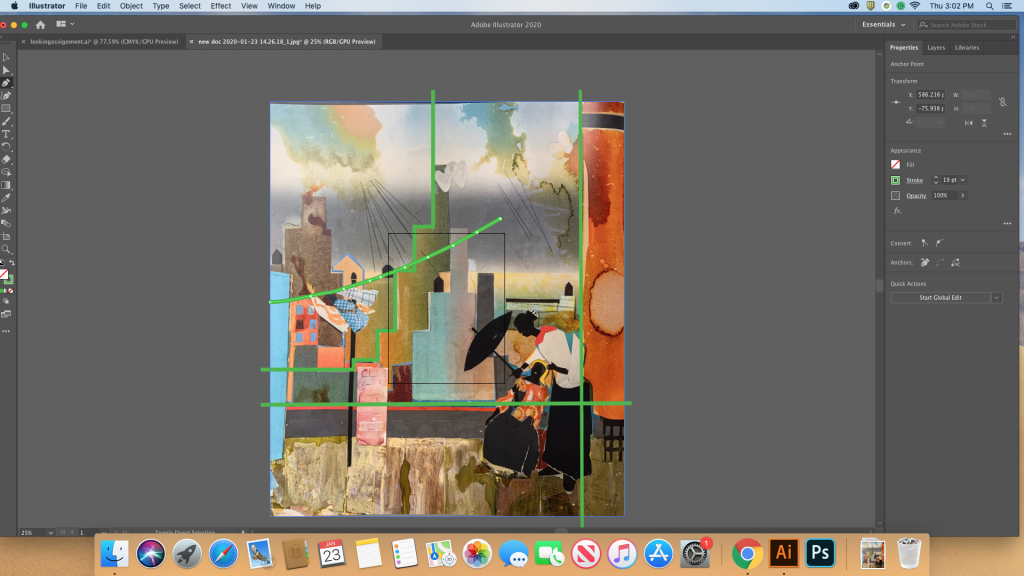
During the lecture, I tried my own take on organizational lines on Illustrator. The program wasn’t entirely foreign since I’ve worked with Photoshop before and they have pretty similar layouts, but I’ve never used a vector program before. I’m not really familiar with the many differences Illustrator and Photoshop have.
Nonetheless, I thought I was doing a pretty good job of highlighting the organizational lines in the picture until I learned that organizational lines usually consist of less than three lines. They’re basically the main movements our eyes focus on in a picture before they zoom in on the smaller rhythmic movements. Organizational lines generally tend to be large and swoopy, mimicking the way our eyes notice the major things in a painting.
In other words, my first take was the complete opposite of what organizational lines were supposed to look like.
We also went over some basic Photoshop commands and tricks. As an intermediate-level student, you’d think I’d know the basics by now, but there were some neat tricks that I wasn’t aware of. One of them was the content-aware fill. This feature basically picks up the surrounding area around the selection you make and fills in the selection with that information.
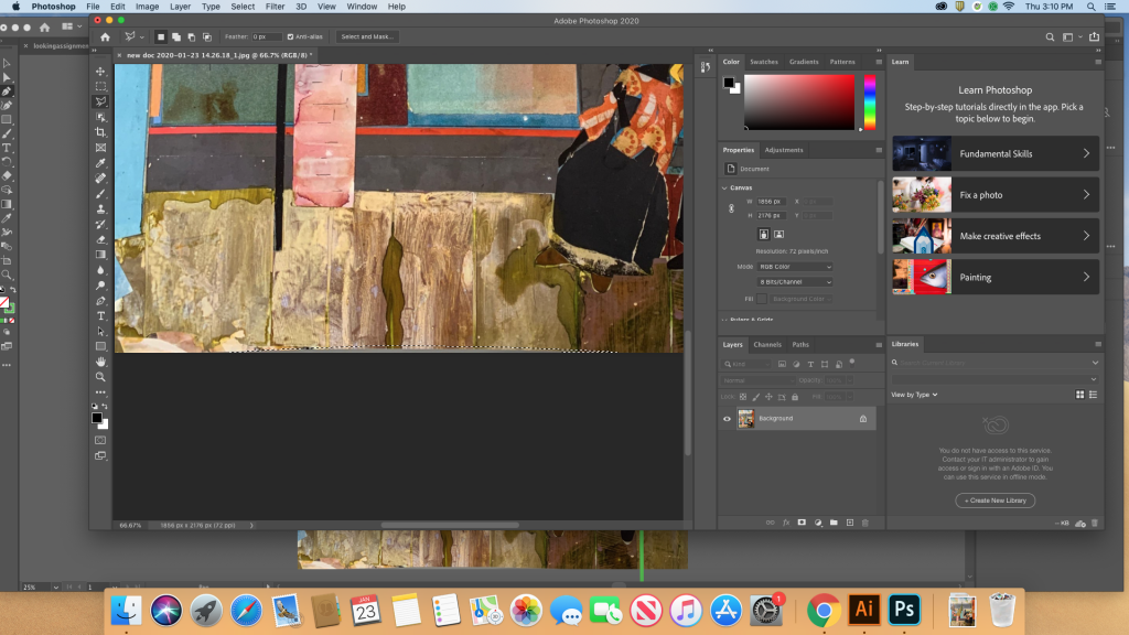
Since our photos were supposed to be entirely flat, I took another scan of the piece and fixed the extra shadows and edges before going back to work. Instead of using the pen tool to draw the organizational lines on Illustrator, I used a regular paintbrush on Photoshop instead. I have yet to master the pen tool on Illustrator, so I’ll probably be sticking to Photoshop for the time being.
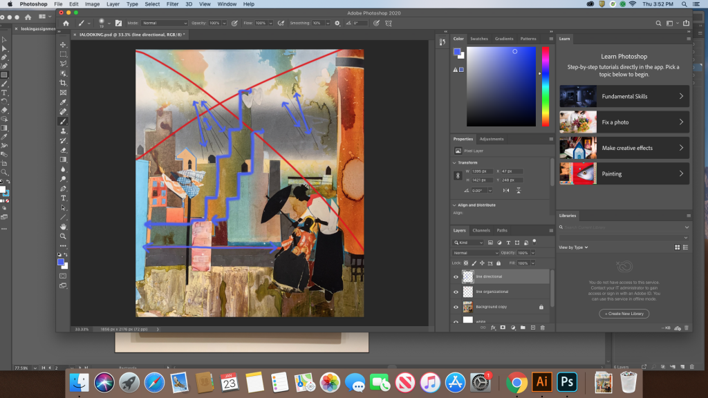
I only pinpointed two organizational lines in my new file and a bunch of directional lines that are highlighted in purple. One problem, though. It turns out that directional lines aren’t complex and they’re just as swoopy as organizational lines. So my directional lines aren’t exactly directional. I ended up erasing most of them in my recent draft and started redrawing them again, this time making sure I only capture swoopy, swishy moments instead of jagged lines. Although I’m no stranger to drawing lines with a mouse, it’s still pretty uncomfortable, so I think I’m going to use my drawing tablet from now on. Stay tuned for the next process log on this assignment. Hopefully, I’ll be able to interpret the three types of lines correctly by then!