Project 3 and 4 — Color Theory: Color Bridge and Bezold Effect
This was a combination of two projects, the first one consisting of creating a bridge that transitioned from one part of the color spectrum to another, and the second one consisting of creating repetitive, visually effective patterns using attributions of the theme we incorporated in our color bridge.
We learned how to find copyright-free images on Google for our color bridge project. The idea was to cut bits of 20 or more photos (that are relevant to our theme) and incorporate each piece into a bridge that visually leads a viewer from one side of the color wheel to another. The importance of gradation and thoughtful transitioning between colors was emphasized in this project. We needed to make sure our bridges felt like a journey and that it let viewers travel from hue to hue. The bridge also had to take a good amount of space on a white background, so that it felt symmetrical and balanced compared to being all over the place or sparse.
I created two versions of a color bridge since the first one wasn’t as visually appealing. My theme, which was the sky and the ocean, stayed the same throughout my process.
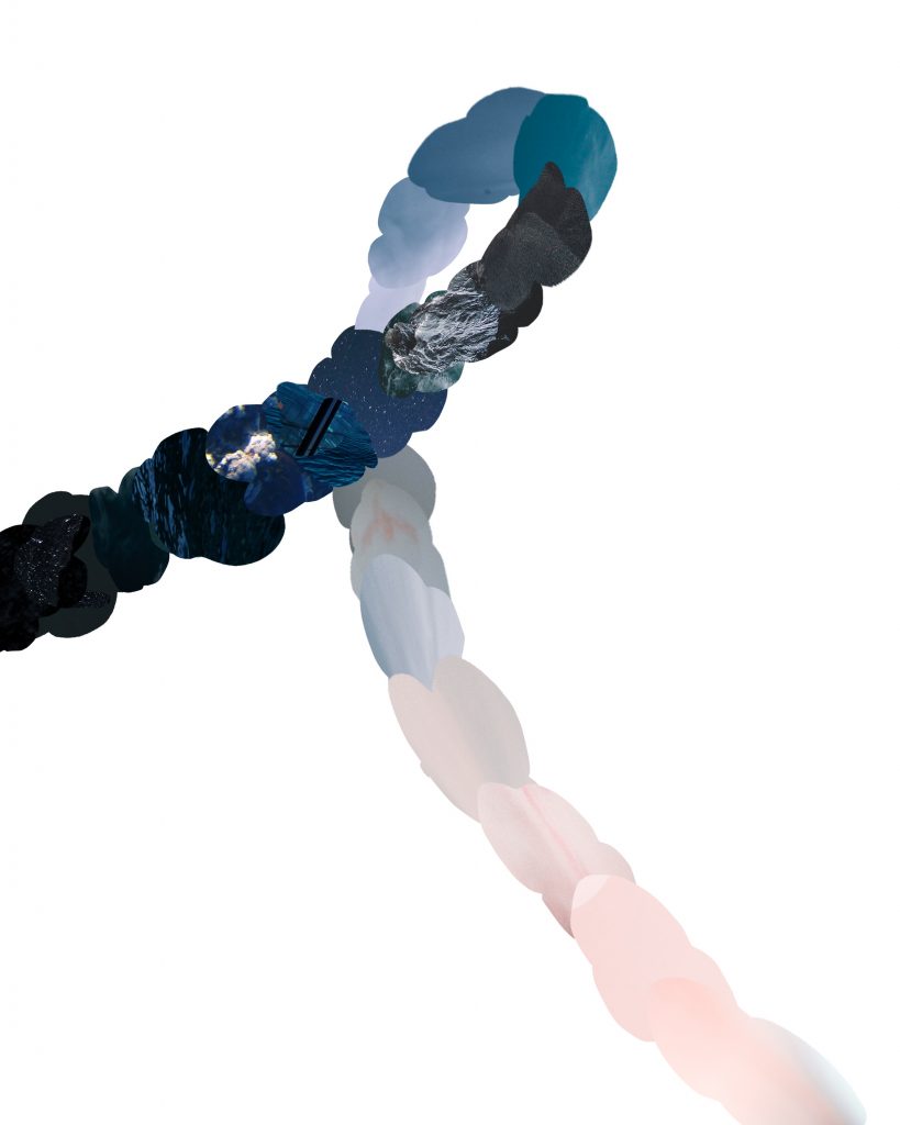
The original color bridge I had in mind for my theme. 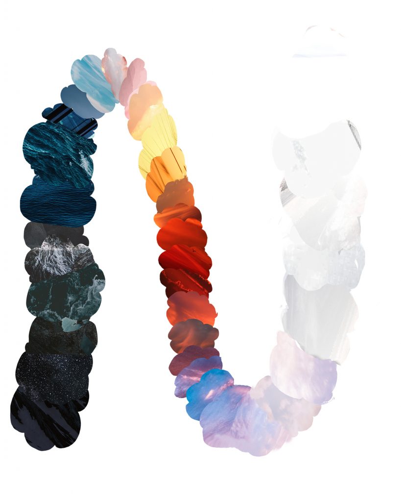
The revised version of the color bridge I had in mind for my theme, taking additional colors such as red, yellow, and orange into account.
After receiving a critique on my original draft, I learned that it was okay to complicate things, as my approach was too simple. I decided to add more colors to the sky, including a sunset, sunrise, and the morning sky, into my color bridge. I added a gradation between yellow, red, and orange that slowly transitioned to purple, blue, and pink. It eventually faded into pastels before ending in a grayish-white. I also took some pieces of photos of the ocean that I found on a copyright-free website. They mostly worked for the darker part of the bridge and I eventually switched to sky pictures for the rest of the bridge since water could no longer cater to the colors I was going for.
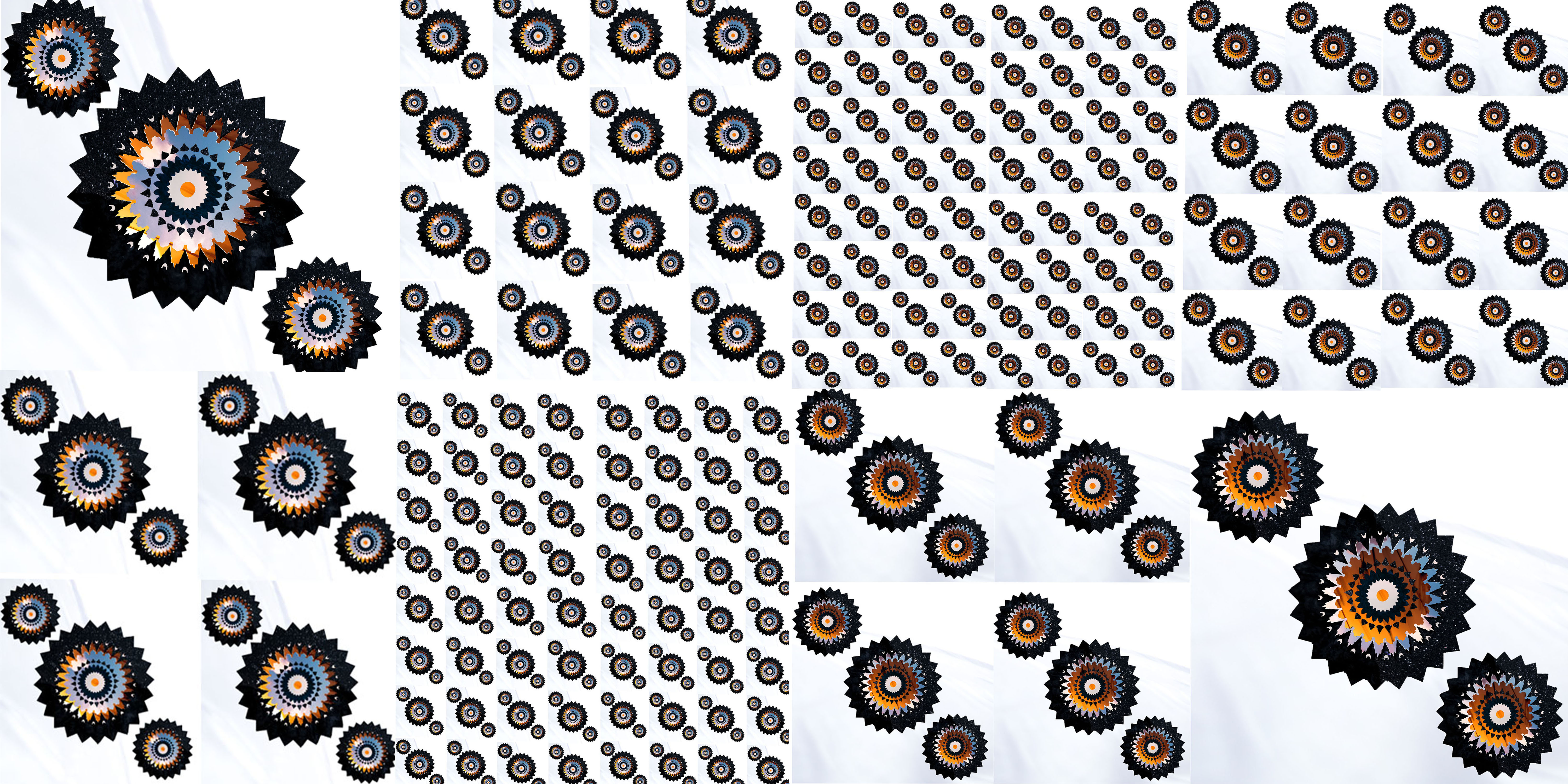
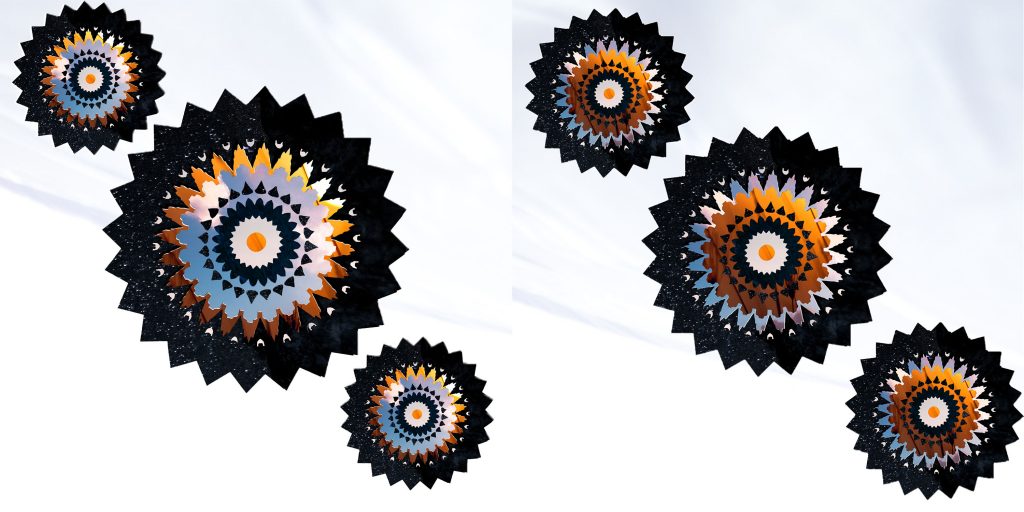
After creating my color bridge, it was time to create patterns. Initially, I simply used colors from the palette I used from my bridge, but then I was suggested to use textures from the photos my bridge consisted of instead. The textures and certain photos made up for the different colors we were required to use, including a pair of complementary and analogous colors, as well as a warm, cool, muted, saturated, light and dark color.
I combined some of the requirements into a set of 4-5 colors to make things simpler. My complementary colors were orange and navy, while my analogous was navy and lagoon blue. The orange I used for the complementary pair also served as my warm, saturated color, while the navy blue served as my cool, dark color. The grayish background was my light, muted color.
Bezold 1
Bezold 2
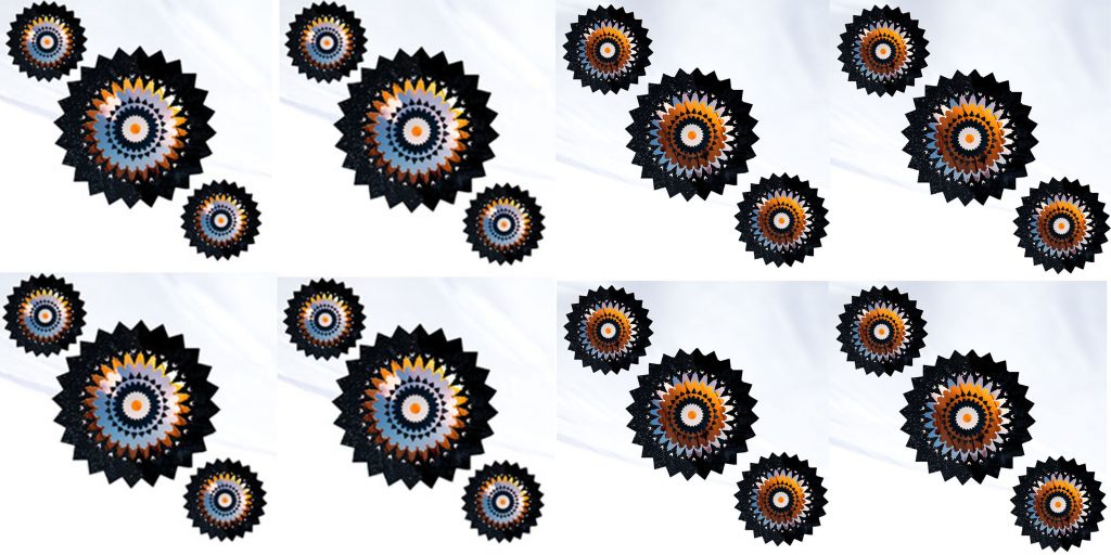
Bezold 3
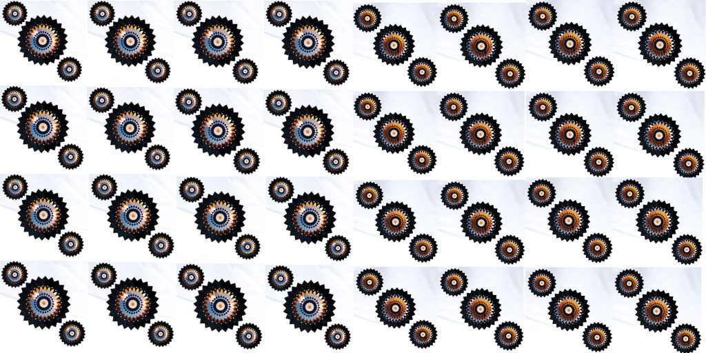
Bezold 4
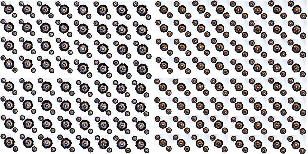
Bezold Final
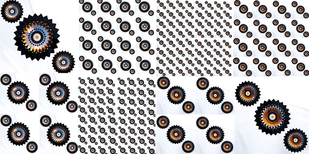
Overall, I did like the project as it was our first step in dealing with colors. I liked learning new skills in Photoshop, including adding textures as a color. I wasn’t able to give my all in this project since we were given about two weeks to complete it and it took me a while to understand what the criteria was exactly asking for. Either way, I like the mandala pattern I used and hope to try something different like mosaics next.