Final Project—Photomontage Book Covers & Flyers
For our final project in ART 144, we read an article called “Varvara Stepanova: The Result of the First Five-Year Project Plan” by Jessica Watson. The article covered Russian artist Stepanova’s style and how she created her photomontages. We learned about Stepanova’s particular style and the features of her work that made it aesthetically appealing. After reading the article and developing a general idea of how photomontages worked back in the 20th century, we looked at other artists’ photomontages and the distinct differences between the various pieces. Most of the artists were European with similar concepts, however, there were some distinguishable qualities that caught my eye. When we were asked to create our own photomontages in the form of a two book covers and respective flyers, I tried to incorporate the certain eye-catching aesthetics I noticed in the artists’ styles.
We were required to create two book covers and two flyers for one book, so I chose my all-time favorite, The Kite Runner by Khaled Hosseini. Despite reading this revolutionary novel in middle school, I remember most scenes vividly and thought I would honor the story by creating some covers for it. I found the book’s content for the photomontages I had in mind. One thing I noticed when we observed the European artists’ photomontages was that most of them were related to political movements. That made sense considering photomontages were used to depict ideas, including the politics going on back then. The Kite Runner was about a family under the rule of the Taliban in Afghanistan who later escaped to San Francisco, so I thought there was enough material to cover in a photomontage.
Some specific details I wanted to focus on in my covers included the novel’s two settings, the significance of the word kite in the title and in the story itself, as well as the symbolism of violence, old neighborhoods in Kabul, blood, and children. All my book covers and flyers turned out different, but I tried including the same imagery from different perspectives.

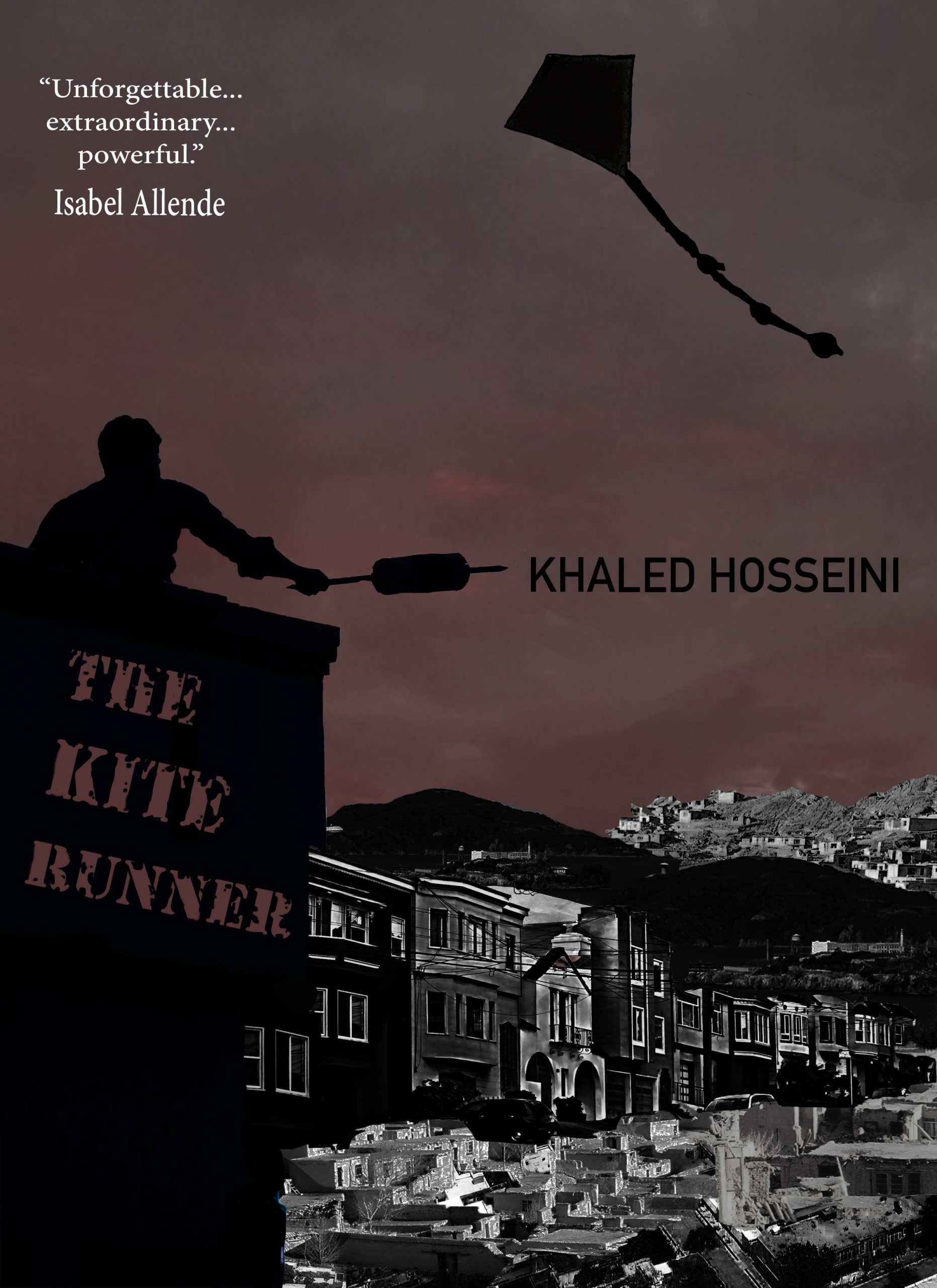
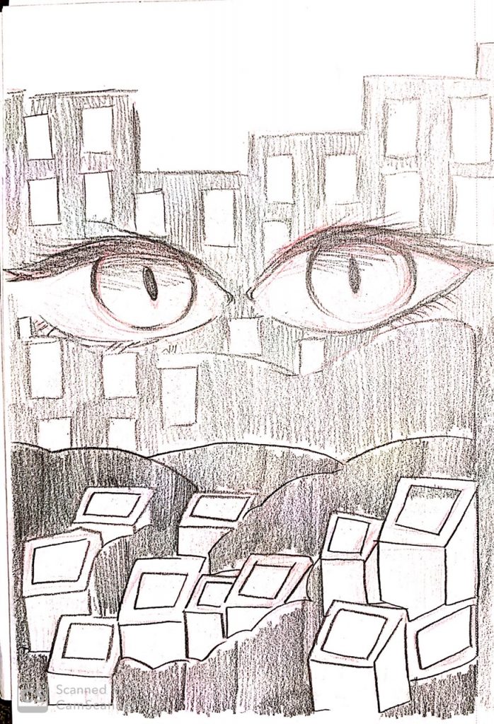
My first book cover was inspired by Varvara Stepanova’s artwork, specifically her piece, Result of the First-Five Year Plan. Stepanova’s artwork consists of very few colors that may seem tedious at first, but the pop of bold color is what makes the piece so intriguing. She used her limited color palette as a way to tell a story, which is what I tried to do too. I combined graphics of both Kabul and San Francisco, turned them black and white, and adjusted the contrast and brightness to make them distinguishable. The majority of my piece is black and white, including the silhouette of a boy flying a kite from a building. In order to make the piece a little less bottom-heavy, I added some more parts of Kabul, including the mountainside, behind the buildings. Stepanova was able to portray a story with literally three colors. I really liked the fact that she made use of limited photography during her time. Photos only came in monochrome and sepia back then. I made the sky a blood red to emphasize the gruesomeness of the setting. The story is very violent in a way, so I wanted to incorporate that into a red, ominous sky the way Stepanova highlighted certain details red in her own artwork. My favorite part is the title. It’s scrawled across the building the way graffiti is seen on vacant walls. I feel like the font, design, and texture can show a sneak peek of how dark the novel is.
My second cover was a completely different take with the same concept of kites, children, and setting. This time, I took inspiration from Dziga Vertov’s Photomontage of Film. I really liked the way he overlayed graphics of similar textures and colors to the point the graphics look like one image. His artwork reminded me of seamless puzzle pieces. I thought it’d be difficult to recreate his aesthetic since my original graphics were completely different, but as I layered and changed the vibrancy, hue, and contrast, it ended up being pretty similar. I like his almost melancholic attitude. He made use of teal in his piece. II tried to do the same thing. I thought teal was the right color to use in my piece because blue is often associated with sadness and loss, which is the moral of the novel. Both Vertov’s piece and this book cover give a filmy, movie poster vibe. One thing Vertov did that I couldn’t cover was his use of texture. His images look almost the same because of a similar texture. I wanted to add texture to mine but I didn’t know how.
My flyers are completely different from the book covers. I thought about incorporating my book covers into a flyer, but I decided that creating them from scratch would be more interesting. Especially since I had more ideas for the novel.
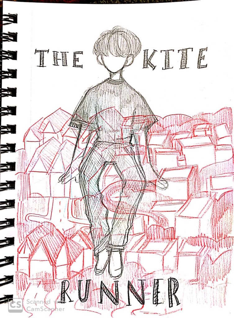
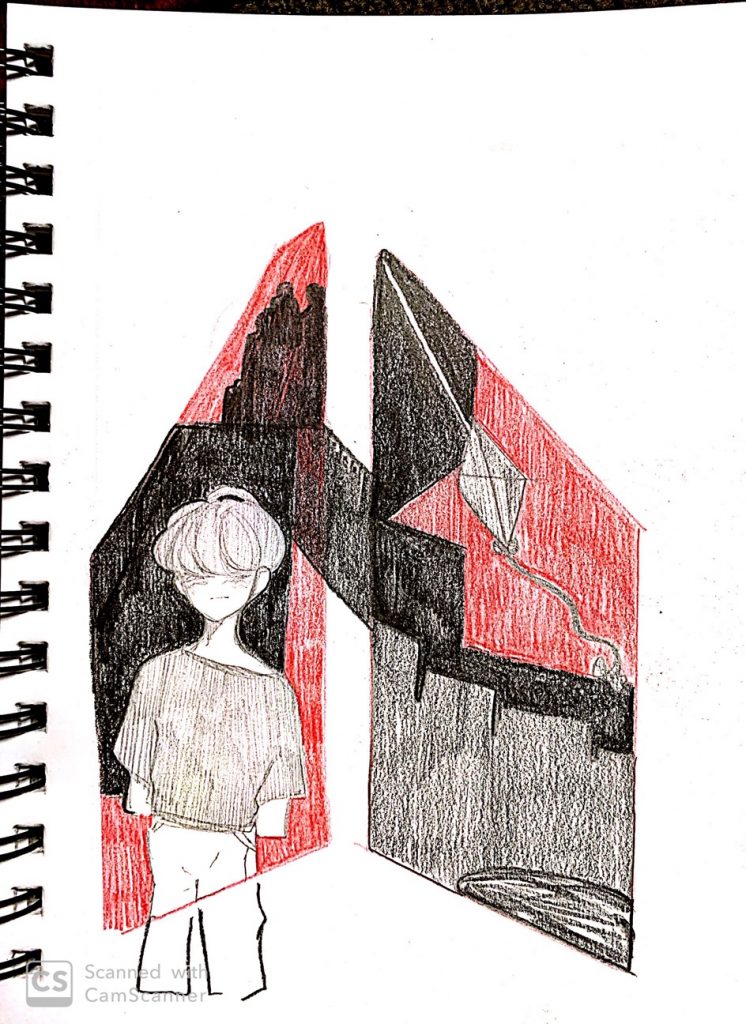
The flyer on the left is still heavily influenced by Stepanova. Despite the flyer being entirely made up of graphics, it looks rather illustrated. I realized that midway but kept it because I still liked the concept of red and black playing a part in the illustration. The silhouette man’s profile, kite, and skyline represent the title, setting, and characters. I added clouds and cut up the silhouettes to emphasize the protagonist’s mentality and how his head was always up in the clouds like a daydreamer. The bloodstains on the skyline represent the violence that happens later on. And the kite is always a classic in the story. Stepanova uses a lot of perspective in her work. The way she positions her graphics is always dynamic. That’s why I tried positioning the diamonds at a weird angle. I wanted more graphics in the piece since it was looking a little plain, but I thought regular squares would be bland.
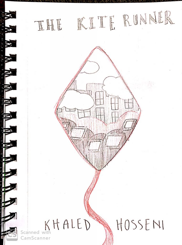
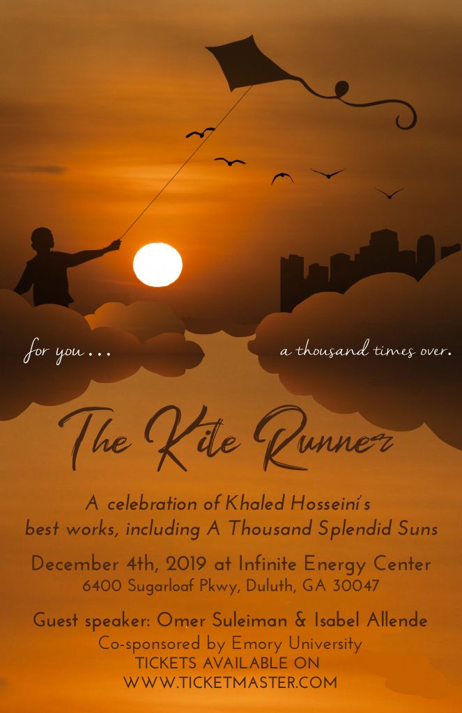
My second flyer is my favorite. I didn’t have any specific artist in mind when I created it, just the fact that a photomontage primarily consists of overlaying different graphics in a way that is coherent. I took a picture of a sunset and cut up certain areas to create additional clouds and a background. I thought the colors of the sunset really depicted the unsettling peace at the end of the novel. I still wanted to incorporate the symbolism of a kite and a boy, and the best way was through a silhouette since it can easily be modified. I think people prefer not to put a face to characters in a novel as well. The boy flying his kite with the birds flying into the sunset gives off a sense of tranquility. There’s a city in the distance because the novel ends in San Francisco. I also added a very notorious quote from the novel in between the clouds for more detail. The font I used is different from the thick, bold letters I used in the rest of the photomontages. I thought a brush script would give it a more carefree feeling. At the end of the day, The Kite Runner is beautiful no matter how thickening the plot is, and reading it is always an experience for me. I wanted to show the beauty of the story through a simple image.