Sequential Images: Black Swan
For our final ART 344 assignment we were given a list of prompts to choose from. Each project was completely different from each other, but the prompt that drew my attention the most was the Sequential Images project. Although Prof Nell gave us the freedom to interpret the prompt in our own way, the project essentially asked us to create a series of illustrations that go in sequence, whether it be chronological, an animation, or a storyboard.
I’ve never delved into animation during my entire art career, but I showed some interest in trying freehand animation via courses. I know that teaching oneself animation was very much possible, but I wasn’t sure if I was cut for the job. It was a very intimidating task, but I thought that there was no better time than now.
Brainstorming Process:
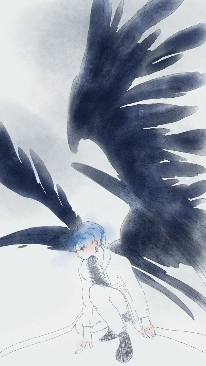
If anything, I knew I wanted my animation sequence to include wings. I see those pretty often and I find the symbolic meaning of wings to be versatile and graceful. I knew my idea was pretty complicated and that I probably wouldn’t be able to execute it well, but I was excited to see how far I could go.
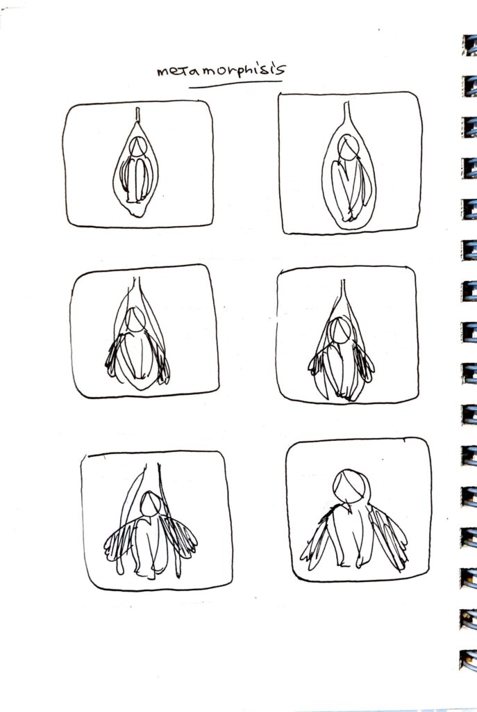
My original ideas consisted of animation a pair of wings that would grow into full length, wings lowering, or a body transforming similar to a caterpillar’s metamorphosis. While all of these were good ideas, I tried to go as simple as possible, especially with the time crunch I had.
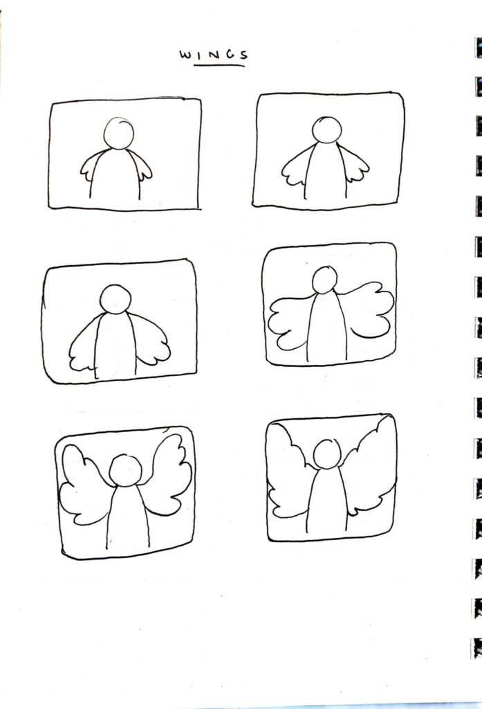
I initially wanted to create an elaborate illustration with a few frames, but I realized I didn’t have the time nor patience for that. Not only would a single illustration take a while, but creating frames and maneuvering detailed pieces around would be risky. Plus, a few frames meant choppy animation.
Theme:
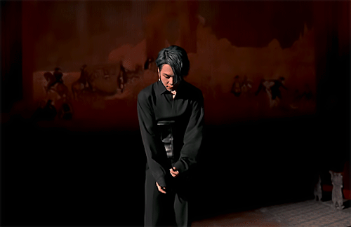
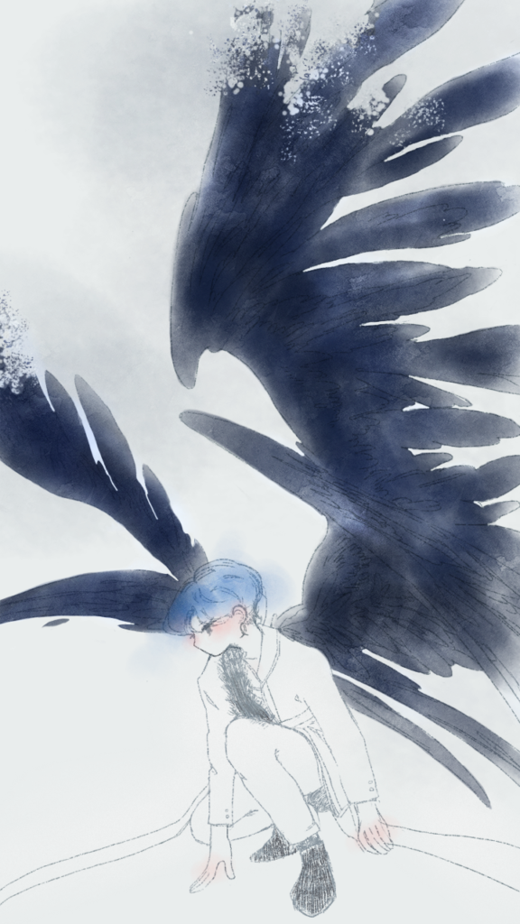
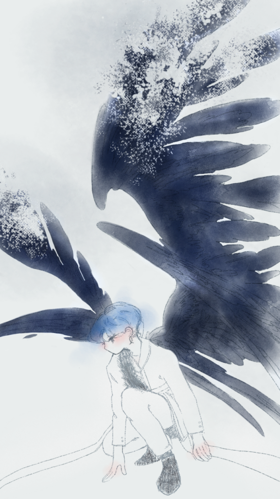
None of my thumbnails had a significant theme, but I gathered inspiration from one of my favorite songs, Black Swan by BTS. The song portrays the agonizing pain an artist goes through when they lose their craft. The choreography, visual cinematography, and lyrics describe the loss and humiliation from different perspectives, but the symbolism of wings used in the music video was the easiest to interpret and mimic. In the gif above, one of the members grows a pair of wings, but I thought that if I animated someone losing their wings, that would execute the concept better. So I scrapped the idea of growing wings and did the opposite instead.
BTS (방탄소년단) ‘Black Swan’ Official MV Photo Sketch, Bighit Labels, 2020. 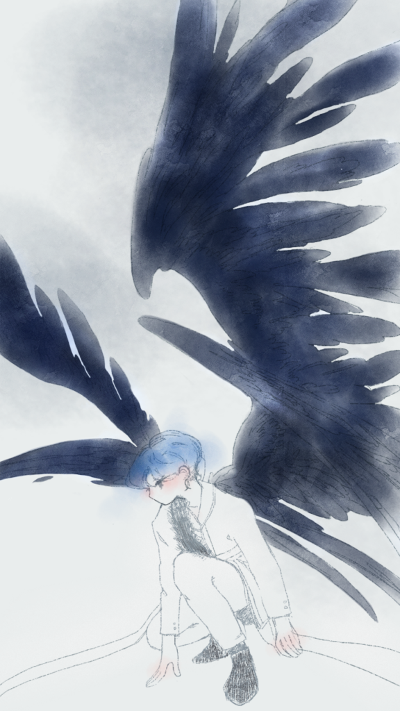
The first frame that I drew based off of the reference photo on the left
Instead of a detailed illustration, I went with looser strokes and soft watercolor washes. I noticed a lot of animations, mainly ones derived from movies, cartoons, and anime, tend to use flat or blocked colors. It’s easier to draw frames that way.
I still needed an animation to reference from, and I found a gif of a person’s wings dissipating into thin air. For copyright reasons, I wasn’t able to post the reference gif, but I just wanted to base my animation on that specific gif. I knew I wouldn’t be able to mimic the animation to the T, but having that on hand made animating my gif easier. I extracted the gif using a converter and ended up with 36 frames.
As an amateur, I didn’t know how to reuse certain frames to save time and minimize the total number of frames created. I ended up creating over 50 frames, but I didn’t mind because most of the frames had subtle modifications and weren’t necessarily drastic. Still, if I were to do this again, I’d do a little more research into recycling frames.
It actually took me 2 days to finalize how my frames would look like. Despite my simple illustration, my execution wasn’t very simple and I had too many things planned. For one, I wanted to animate more than just wings. I also wanted the background to fade and the model’s clothes to gain color, starting from the center. While these sounded like great ideas, I wasn’t able to animate those well, and whenever they did, they just looked confusing and choppy, so I had to focus on one thing instead.
The wings reference gif dissipated in a series of patterned dots, so I tried copying that by using an ink splatter brush to spray all over the wings in each frame.

The animation program I used was Photoshop. Not only is it a program I’m very familiar with, but because this isn’t my first time using video software, the timeline window looked similar to Premiere and DaVinci Resolve. I watched one video about it and got to work. I didn’t have the intention to do anything fancy, but looking back, I wish I watched more attentively just to see how far I could venture. I thought I knew the basics of dynamic, fluid animation, but I’m still getting there.
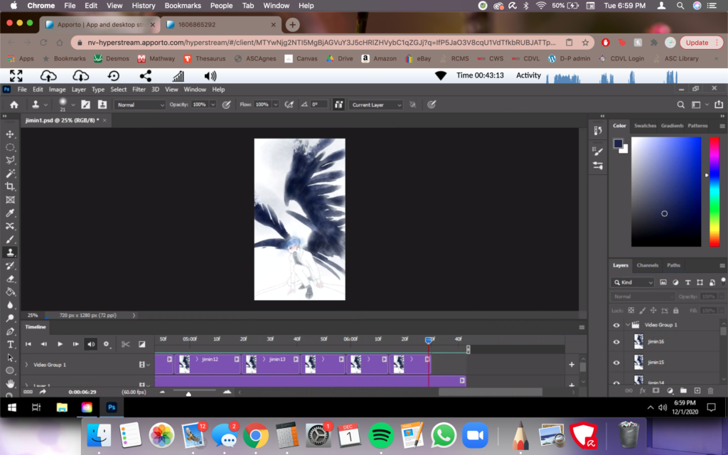
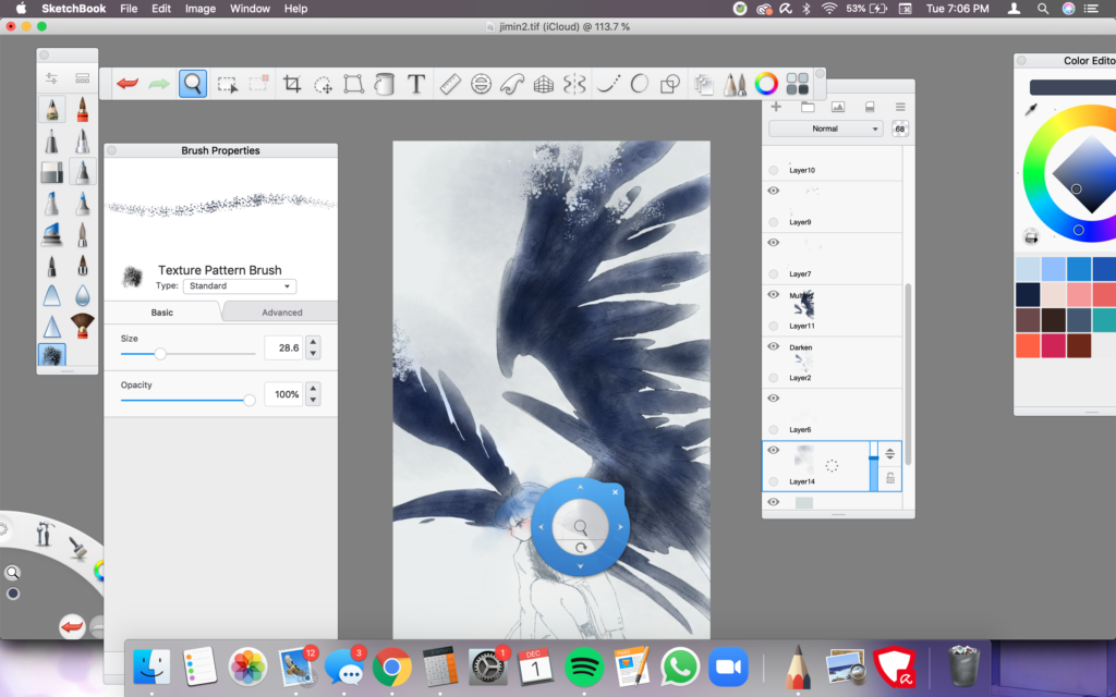
The reason why I created my frames outside of Photoshop was because I already had installed custom brush packs on Autodesk Sketchbooks that would fit my coloring style. It saved a lot of time, despite the tedious trips between saving the files and uploading them onto Apporto separately.
Aside from the wings, the other thing I wanted to animate was the fading transition of the dark background behind the wings. There’s a splatter of black right behind the wings that I wanted to remove along with the wings. So, with each frame, I lowered the opacity by 2% until I eventually hit 0.

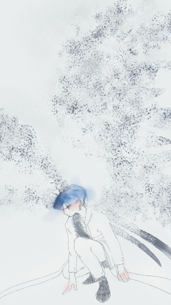
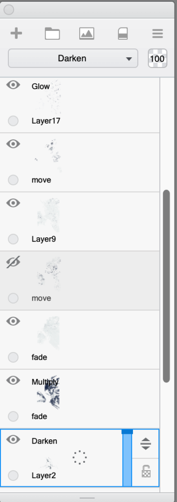
After animating the wings into a series of flurry-like dots, I tried to animate the remainders in a way that they shifted before disappearing. I did this by moving layers around, labeling which ones I wanted to fade and which layers would “move” simultaneously. This helped me distinguish what to do change in each frame. The layers titled ‘move’ shifted in different directions while the layers titled ‘fade’ had their opacity lowered by a certain percentage. I checked the animation in-between frames and ran it through a couple of times and I noticed that while the fading transition was nearly perfect, the shifts were pretty choppy. That was something I should’ve paid attention to during my research. But as a beginner, there’s only so much I can understand. I felt that there was a pretty noticeable jump cut in between, and I think that’s the result of moving the layers a little farther than anticipated.

The timeframe rate I used at the end was 12 frames per second as I followed what was done in the reference video I watched. From my understanding, 12 frames per second aren’t necessarily slow, but the duration of each frame is around 1 second. I just elongated it to around 3 seconds.
While I’m still proud of my efforts, a few things I would reconsider for future animation projects would be:
- Studying time frame rates/FPS to see what works best for hand drawn animations
- Researching additional tips and suggestions from other animators
- Researching other animation centric software besides Photoshop
- Researching how to create more fluid animation, and how that would look like in terms of frames
- How to recycle frames under a time crunch
It’s safe to say that if I were to do another animation project, I’d begin with a lot of time on hand and prepared research. But I’m glad to have at least tried and fulfilled one of the goals I had for this class. Maybe I will even take an animation course via Linkedin Learning during the upcoming winter break and see how I can incorporate my findings into my next project.